The CODAP website has a growing library of CODAP help resources aimed at highlighting handy features and improving your CODAP experience, so you can do even more with data exploration and visualization. Below you’ll find a sample of recent CODAP help resources and some additional CODAP features you may not have known about. Read on to add some new tools to your CODAP tool belt!
1) Built-in plugins in CODAP
Eight built-in plugins extend CODAP’s functionality. For example, you can use the NOAA Weather plugin to gather historical weather data from around the U.S. or use the Transformers plugin to make data moves such as “pivot longer” or “outer join.” Learn more about all the built-in plugins, then try them for yourself by clicking the “Plugins” icon in the top toolbar in CODAP.
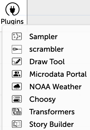
Eight built-in plugins allow you to explore data.
Want even more plugins? Check out our comprehensive list or develop your own!
2) Explore a range of statistical measures in CODAP
Did you know there are 14 different ways you can explore statistical measures in CODAP? With just a few mouse clicks, you can add measures such as the mean and standard deviation to a graph. The help pages walk you through each of these different ways of exploring statistical measures.
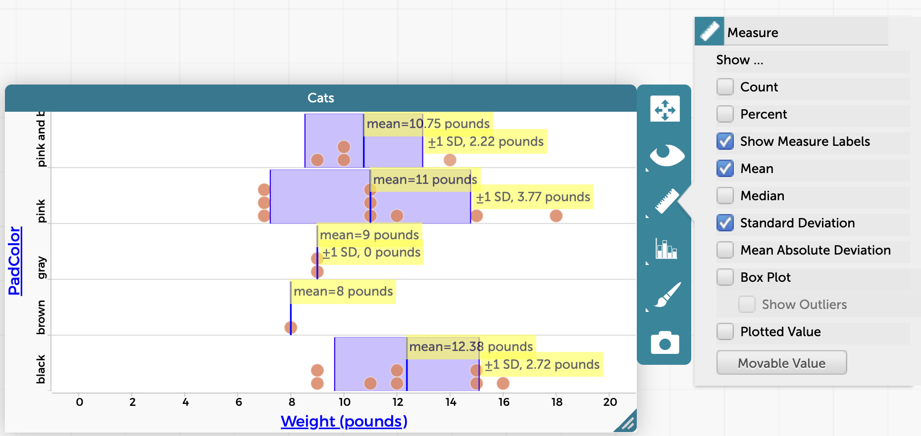
The mean, standard deviation, and measure labels are visible in this CODAP graph of cats’ weights vs. the color of the pads on their paws.
3) Drag data points on a graph to explore statistical measures
Would you like to see what happens to the mean or median if a value is changed? Dragging points on a CODAP graph temporarily changes their values, allowing you to see the effect on statistical measures such as mean or median. Watch the video below to learn more.
4) Plot a least squares regression line and show fit uncertainty
CODAP allows you to automatically plot a least squares regression line on a graph with the click of a checkbox. You can add a least squares line and show the uncertainty of the fit on any graph with numerical attributes on both axes. Read this help page for all of the details.
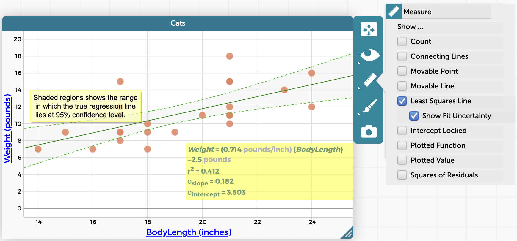
Plot a least squares regression line and show fit uncertainty by clicking on the measure/ruler icon to the right of the graph.
5) Assign CODAP documents and see student work
Wondering how to get students to delve into interesting datasets in CODAP? We recommend three methods for exchanging CODAP documents with students: blank or example documents, shared views, and Google Classroom assignments.
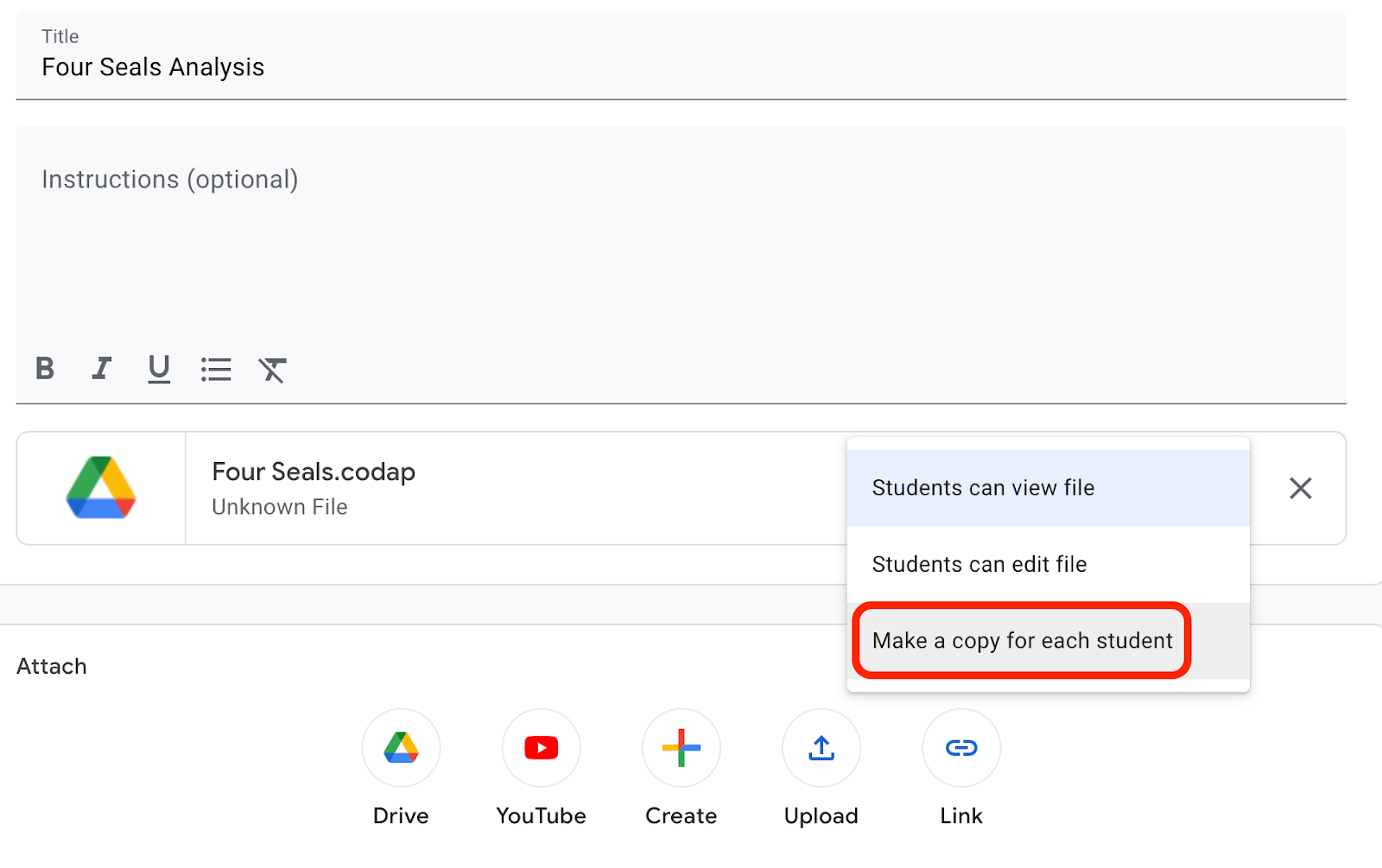 When you assign a CODAP document in Google Classroom, each student will have their own editable copy of the file.
6) Create custom map boundaries
CODAP has built-in boundaries for maps of U.S. counties and states, plus countries around the world. But what if you want a map with different boundaries, say, Canadian provinces and territories? The video below shows you how to import map boundaries into CODAP.
7) Join two tables in CODAP
It’s possible to join two separate tables in CODAP together by an attribute shared by both tables. To do so, click on the name of the attribute in the header of one table and then drag and drop it on top of the name of the attribute in the other table.
You may want to experiment with dragging the attribute both ways (e.g., from table A to table B or from table B to table A) to join the two tables, as the results could be somewhat different depending on the direction in which you drag. See this help page for more details.
Note that the built-in Transformers plugin (described above in No. 1) enables additional ways of joining two tables, such as through the “inner join” and “outer join” transformations.
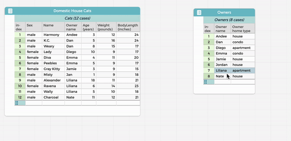
Dragging attributes allows you to join two tables in CODAP.
8) Split a graph horizontally or vertically by a categorical attribute
Do you ever run into phenomena that would be great to compare side-by-side (or top to bottom)? If so, CODAP has the perfect feature. You can split graphs horizontally or vertically using categorical attribute values. Find more details on this how-to page.
Split a CODAP graph horizontally or vertically.
9) Create bar graphs in CODAP
If you’ve ever wondered about making a bar graph in CODAP, we’ve got you covered. If you have a graph showing just one categorical attribute, you can fuse the dots into bars, as described in this help page. (Note that a new axis appears showing the count of cases for each category.) It’s also possible to plot numeric values as a bar for each point. For example, in a dataset where each case is a person, instead of having points/dots for people’s heights, you could have a bar representing each individual person’s height.
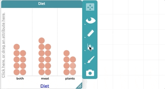 Make a bar graph in CODAP by fusing dots into bars.
We hope you enjoy exploring these CODAP features. There are many more helpful resources on the CODAP website, including the CODAP help pages. If you’re stuck, try searching the CODAP help forum to see if someone has asked your question before, and if not, create a post to ask. We’re happy to assist your data explorations.