In August 2017, Hurricane Harvey evolved from a series of thunderstorms to one of the first major hurricane landfalls in the United States since early 2005. Right on the heels of Harvey, Hurricane Irma blasted through the Caribbean and onto the U.S. mainland, striking Florida in early September.
The National Oceanic and Atmospheric Administration (NOAA), which aims to understand and predict changes in weather, provides educational resources and datasets about hurricanes.
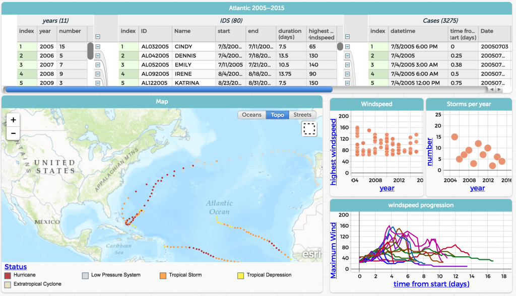
The dataset for 2005-2015 is available in our Common Online Data Analysis Platform (CODAP), a free and open-source web-based data analysis tool, geared toward middle and high school students.

Screenshot of NOAA hurricane data embedded in our Common Online Data Analysis Platform.
With all the current catastrophic news about hurricanes, students have lots of questions. Use the data to help them understand the history and characteristics of storms.
- To investigate the paths that hurricanes generally follow, use the slider to change the year from 2005 to 2015, and watch the data points on the map, which represent the general path of the storms.
- To determine the storm with the highest wind speed, click the top data point in the wind speed graph, which plots year against highest wind speed. Since data is linked across multiple representations, the data point is highlighted on the graph and in the table, so you can find the name and date of that particular storm (e.g., Wilma, October 15, 2005, with top wind speeds of 160 mph).
- To learn which year had the most or least number of storms, look at the storms per year graph. Notice an outlier in the data with year 2005, which had 15 storms during that season. (Note: This was the same year as Hurricane Katrina. Select KATRINA in the table and make sure the slider is set to 2005, then see the path of the hurricane graphed on the map.)
- To see a relationship between wind and pressure, click on the Graph button. Drag the Maximum Wind column header from the table to the vertical (y) axis until the axis turns yellow. Drag the Minimum Pressure to the horizontal (x) axis until the axis turns yellow. (Note: you may need to scroll to the far right of the Case Table to see these columns.)
Analyzing and interpreting data is one of the key science and engineering practices of the Next Generation Science Standards (NGSS), and representing and interpreting data are featured throughout the Common Core State Standards (CCSS) for mathematics. Students can use publicly available datasets from storms and other weather events to learn more about the world around them.