Leticia Perez is a Senior Professional Learning Specialist at WestEd. Frieda Reichsman is a Senior Research Scientist at the Concord Consortium.
Headlines make the news all the time warning of warmer winters, changing seasonal patterns, life-threatening heat, or alternately dangerous freezing conditions. Whether you’re in Massachusetts or California, or somewhere in between, nearly everyone has experienced some form of extreme weather. Now you can use CODAP to make sense of weather data in your locale.
Across the U.S., there are 1,700 weather stations that report measurements to the National Oceanic and Atmospheric Administration (NOAA). With most locations boasting at least 80 years of data, these datasets offer robust opportunities for students to make sense of extreme events and how they differ from typical weather patterns.
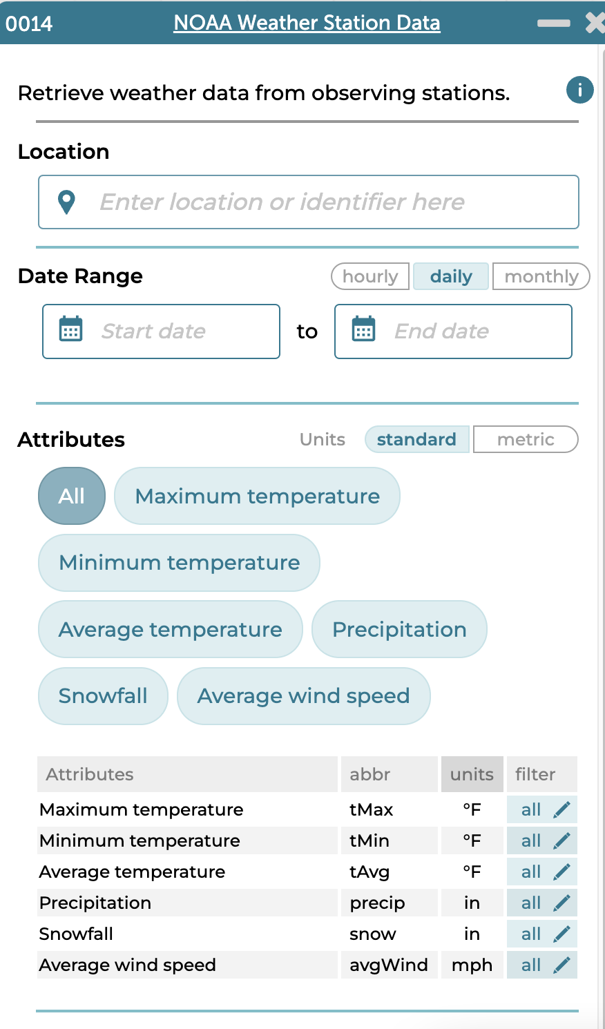
The WeatherX project created a NOAA Weather plugin for CODAP that allowed users to get hourly, daily, and monthly weather data for a location of their choice. The Boosting Data Fluency project, a National Science Foundation-funded collaboration between WestEd and the Concord Consortium, recently redesigned the plugin’s user interface and added new functionality to make it even easier for students to explore and interpret local extreme weather data.
One important new feature is the ability to filter data by focusing on what’s most important and removing unnecessary data. NOAA datasets are large, but filtering the dataset for attributes such as extremely hot days produces a smaller dataset. For example, while Palmdale, California’s daily weather record contains 20,000 cases, there are just over 1,600 cases for the temperature extreme of 100+°F. While still large, that’s a more reasonable number to manage.
Below, we describe how to use the NOAA Weather plugin to find the number of extreme heat days in my hometown, Palmdale, California. Follow along, then try the steps for your own location.
How to Use the Updated NOAA Plugin
-
- Launch CODAP and select “CREATE NEW DOCUMENT.” Click Plugins in the top bar and choose NOAA Weather from the menu.
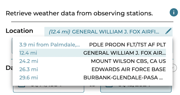
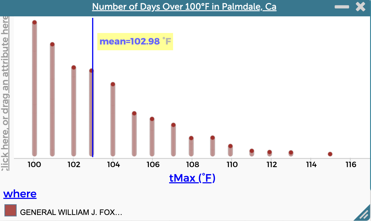
- Type Palmdale, California, in the location box. The plugin will identify NOAA weather stations that are close to the location entered. Select the teal box above the location field to choose General William J. Fox Airfield.

- Select the following date range: 1/1/1974 to 1/1/2024.
- Since we’re exploring extreme heat events, we’ll look at daily values.
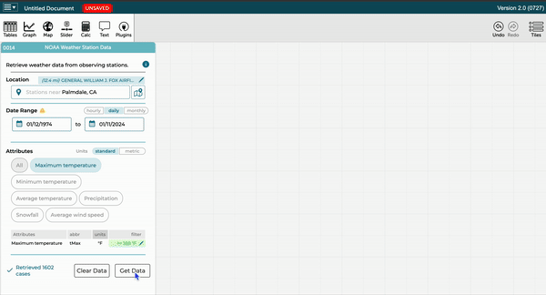
Note: The plugin issues a “Data Return Warning.” This warning occurs any time the parameters set within the plugin would result in more than 5,000 cases of data, which is CODAP’s recommended limit. CODAP will support larger datasets but its performance is affected. For now, we’ll ignore the warning button by closing it. In the next few steps, we will filter out cases by temperature, which will reduce the total number of cases. - The NOAA Weather plugin retrieves data about temperature, precipitation, snowfall, and wind speed by default. Click All to deselect all attributes, then select Maximum temperature.
- We’ll continue to filter the data that meets a particular condition by further narrowing the range of values. Let’s look for data for only those temperatures that are greater than 100°F. Select the box with the pencil button in the filter column. A dropdown menu of filtering operations is available by clicking the equals button. Select “greater than or equal to” and then type in 100 degrees as the temperature. Click Done.
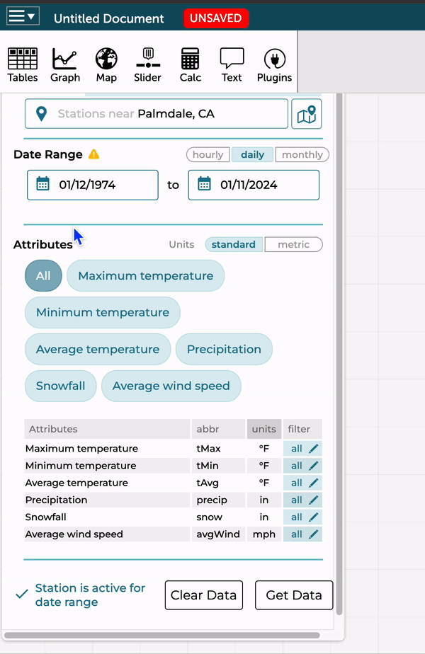

In a data exploration, filtering can be a powerful data move to reveal patterns otherwise hidden within a dataset. In this case, the thresholds for extreme heat vary by climatic regions (e.g., typical seasonal temperatures). For Palmdale, California, we’re looking at days over 100° F, but in Juneau, Alaska, days above 90° F may be considered extreme. The ability to specify both range and numeric value for a location is especially important for comparing extreme heat events across different regions. - Finally, click Get Data. The plugin portal makes its request to NOAA and brings the data into CODAP in a table. The 1,602 cases within the table all represent days in which the maximum temperature was equal to or exceeded 100° F. With this dataset, we can ask questions such as “How many extreme heat days have there been in Palmdale, California?” (summary) or “Have the number of extreme heat days increased over time” (relationship)?

- To further explore the data and answer some of our questions, we’ll make a graph by dragging the “tMax” attribute from the table to the x or y axis. (Learn more on CODAP’s Help page, “Getting Started with Graphs.”) For this attribute, we’ve made two different representations of the tMax temperature. Consider how you might use these plots to summarize the number of days that qualify as an extreme heat day.
- In this dotplot we can use the Measure (ruler) button on the palette to add the mean and label its value.

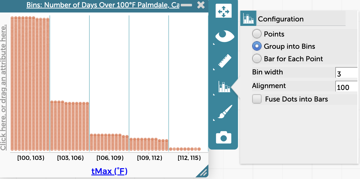
- Using the Configuration (graph) button, we can group the values into bins, producing the figure below.

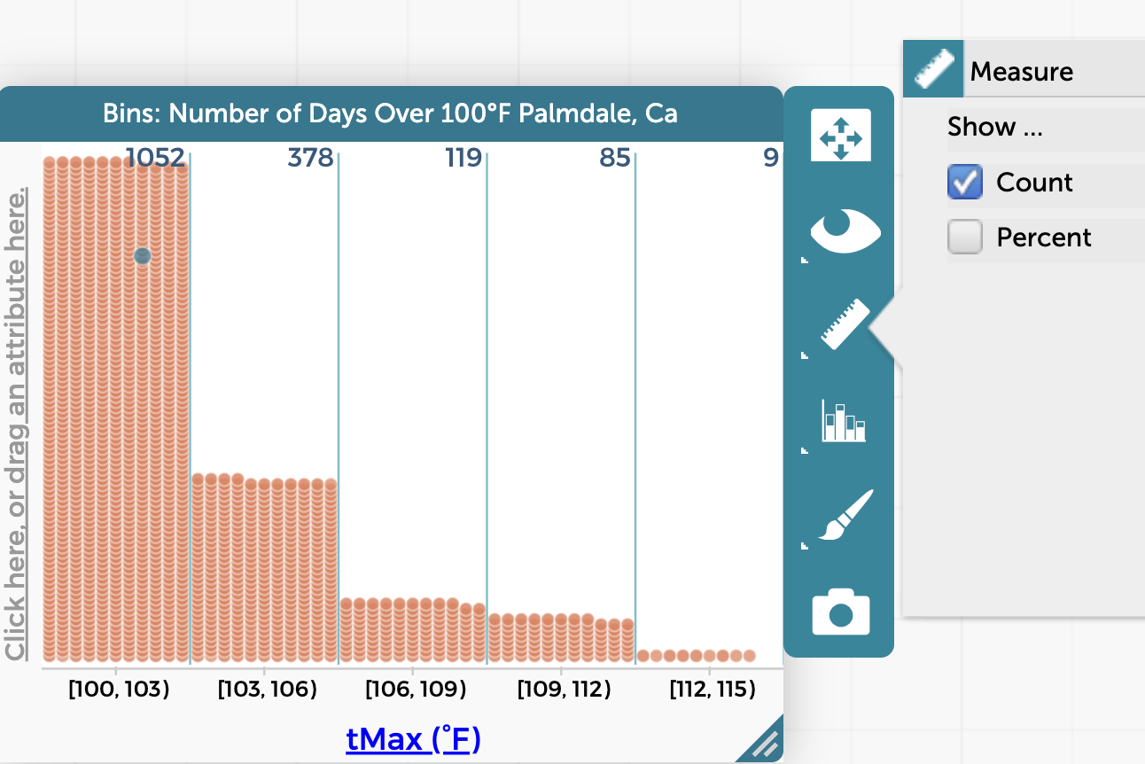
- The Measure button now includes options to display the count or the percentage to each column. Using Count we can calculate percentages (a 6th grade math standard) and see that 65 percent of the extreme temperature values are between 100-103 degrees.

- In this dotplot we can use the Measure (ruler) button on the palette to add the mean and label its value.
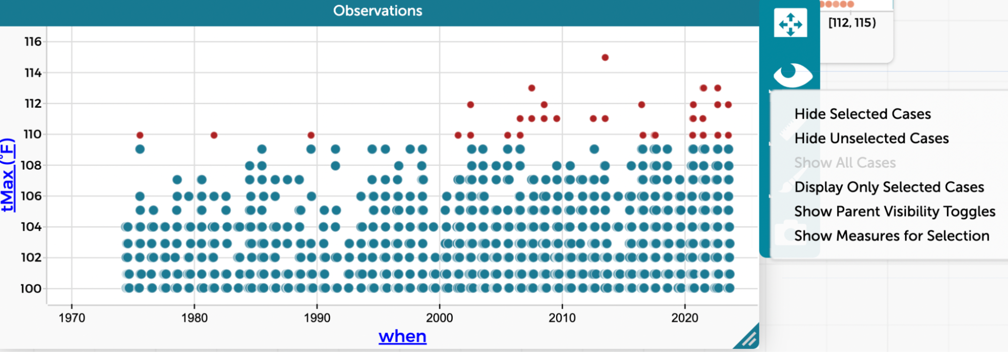
- Is Palmdale experiencing more extreme heat days over time? To find out, we’ll create a time series plot by dragging the attribute “when” to the x-axis and “tMax” to the y-axis. Just looking at the plot, it appears that there are slightly more points after the 2000’s compared to the mid 1970-1990’s. The maximum temperature for these extreme hot days appears to be getting hotter too. What other data moves might we make with this dataset?
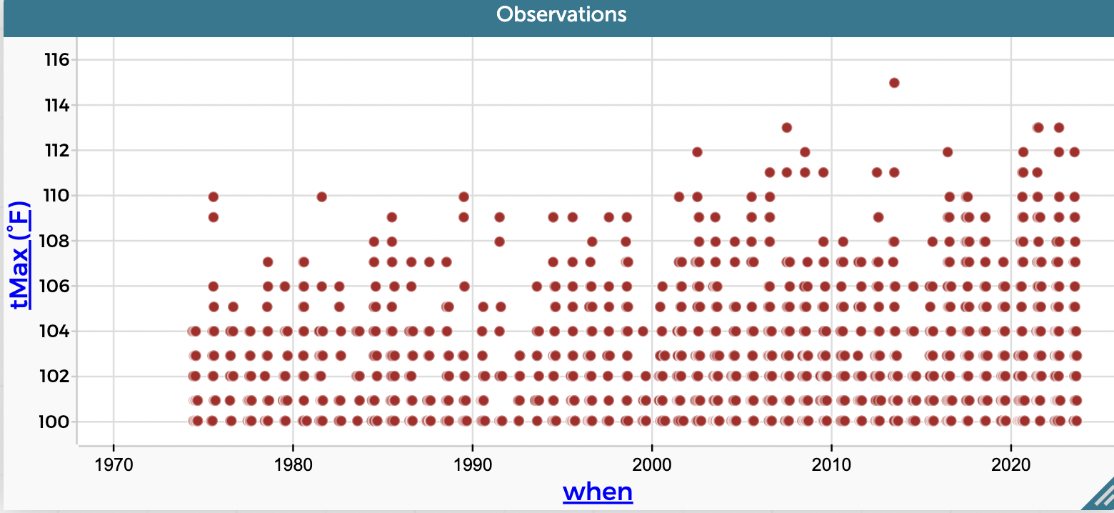

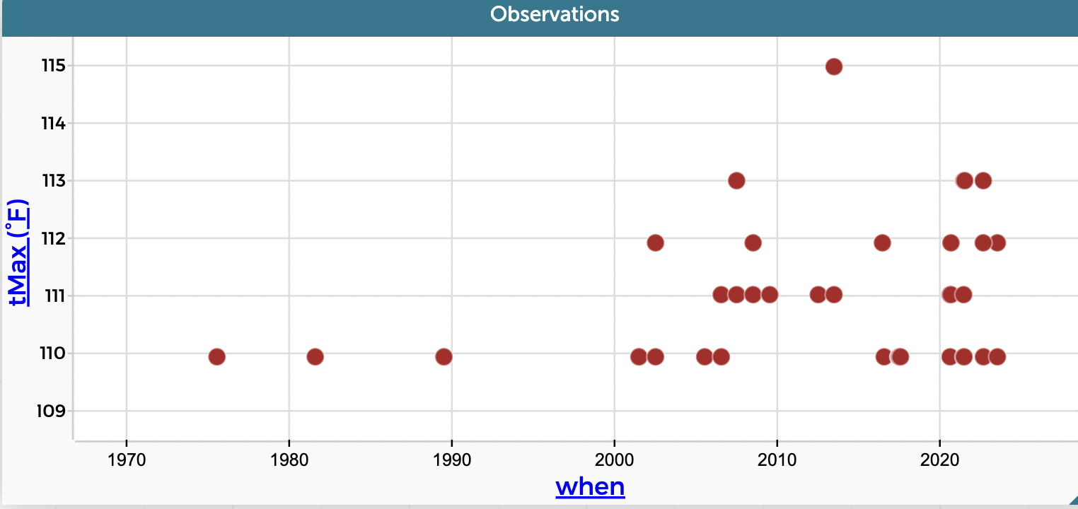
- Let’s try hiding the temperatures below 110 to see whether the number of super hot days are really increasing by decade. Select all the values below 110 by dragging over them with your cursor, then click the eyeball in the palette, and choose Hide Selected Cases. From 1974 to around 2001 there are no records above 110°F. But after around 2001 there were 18 values above 110°F. Yikes!


This exploration has shown us that while the desert of Palmdale, CA, has had very warm days, the number of extreme heat days and the tMax or maximum temperature is rising. It is important for students to develop techniques for identifying the typical weather patterns in a region and identify outliers. Students could use box and whisker plots to identify values that are in the top 25% and outliers. The MAD would be helpful for students when predicting how much variation from the mean they should anticipate when going outside during the summer.
As teachers and students explore climate change and the science behind it, using the NOAA Weather plugin in CODAP makes it easy to access local data and supports place-based investigations that are both relevant and meaningful.
To explore other datasets created by the Boosting Data Fluency project, visit our Data Biographies Collection.
This material is based upon work supported by the National Science Foundation under Grant No. 2101049. Any opinions, findings, and conclusions or recommendations expressed in this material are those of the author(s) and do not necessarily reflect the views of the National Science Foundation.
One thought on “Explore extreme weather in your area”
Comments are closed.
How do I subscribe to get the forecast?