For nearly 18 years, our logo has been a beautiful and complex sunflower, created by Senior Web Developer Noah Paessel. (He was Noah Fields back in 1994 when he worked at the Concord Consortium during his first stint with us, but that’s another blog post!)
With the former logo, our founder, Bob Tinker, wanted to showcase the Fibonacci sequence in nature, which represents a fascinating link between the sublime and the natural world and invites scientific inquiry and mathematical investigation. (Sunflower seeds exhibit many different Fibonacci spirals in their close-packed patterns, as do many other things in the natural world . Bob also thought Concord as a place evoked important concepts of revolution and free thinking and that the etymology of the name “Concord” linked with the sunflower expressed the ideas of “sharing one’s heart” and being “of the same mind,” both of which resonated with his pacifist and gentle nature.
We are now proud to announce our new logo, created by Derek Yesman of Daydream Design.

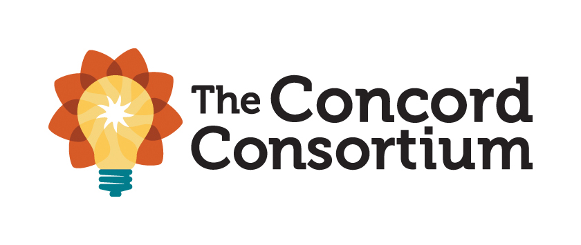
This logo both simplifies and augments our original logo. It morphs the original sunflower while also referencing both technology and our core mission of generating, experimenting with and spreading important ideas.
The central star represents the initial spark of an idea, that “a-ha moment” of inspiration that can so quickly turn into extended experimentation – or possibly into a whole new research project. The light bulb surrounding it represents how we work to build these inspirational flashes into complete ideas and products and determine their potential to improve teaching and learning. The petals and radiating elements in the background represent our mission to spread the best of these ideas outward to transform learning for millions around the world.
We’ve recently modified our tag line to make this mission (and our ties to Concord’s location and history) even more explicit: Revolutionary digital learning for science, math and engineering.
By the way, for all you font geeks (don’t hide – we know you’re out there!) our logotype is rendered in Museo 500, part of Jos Buivenga’s excellent Museo family. We discovered this font when we worked with ISITE Design during our last website redesign – thanks Patrick! – and fell in love. Since then, we’ve explored the many weights of this font as well as its sans serif and slab variants. We’ve also had some early-adopter fun watching this font gain status and uptake in many print and Web locations on its way to becoming a modern classic.
We’re excited about this new logo and about how it represents an evolution we’re in the midst of as well. As we evolve toward a new phase as an organization while still embracing our legacy as pioneers in educational technology, we’re more committed every day to creating a bright future for STEM teaching and learning.
One thought on “Hello, world!”
Comments are closed.
Nice and creative.