Indicators of Data Fluency: What Am I Looking For?
Data is the new “it” thing of the 21st century. From guiding traffic flow to planting crops, informing health decisions, and shaping public policies about all manner of things from incarceration to employment, data is used in countless applications and industries. Every student needs to emerge from their K–12 education having extensive data experiences. Importantly, they should be able to do things with data—explore, visualize, find patterns, identify problems, investigate sources, think about the ethical use of data, and more. These are the hallmarks of data fluency. The Concord Consortium and WestEd are collaborating on a new project funded by the National Science Foundation to promote such data fluency.
The Boosting Data Science Teaching and Learning in STEM project is developing a framework to describe the knowledge and skills teachers need to promote data fluency in their classrooms. With the help of a cadre of co-development teachers, as well as data scientists and educational researchers from across the country, the project aims to construct a Teacher Data Fluency Framework that details what teachers need to know, and be able to do, to support students in grades 5–9 to develop data fluency in science, mathematics, and computer science.
We will use this framework to guide the design of materials for teacher professional learning, then study the effects on both data science teaching and data science learning in the classrooms of teachers who have participated in the professional learning experiences. This four-year project will shape our answers to questions such as “How can teachers and students develop data fluency? What does data fluency look like? How do you know it when you see it?”
What follows are preliminary indicators that help us recognize data fluency. While these indicators serve only as a starting point, they are informed by decades of work with students and teachers using data in mathematics, statistics, and science. We’ve become convinced that engaging with data in a meaningful way beyond the primary grades requires technology. Using technology tools, like our Common Online Data Analysis Platform (CODAP), can make it effortless to manipulate data, conduct calculations, and make visual representations, such as graphs.
Data-rich classrooms
First, let’s set the stage by peeking into a data-rich classroom. In some cases, we see students conducting their own experiments to answer a question, gathering data, constructing and analyzing graphs, and sharing their findings and the limitations of the data. In other cases, students produce a survey to gather data. More than ever before, students are also making use of countless existing publicly available datasets, and engaging as practitioners, explorers, and discoverers in every subject area.
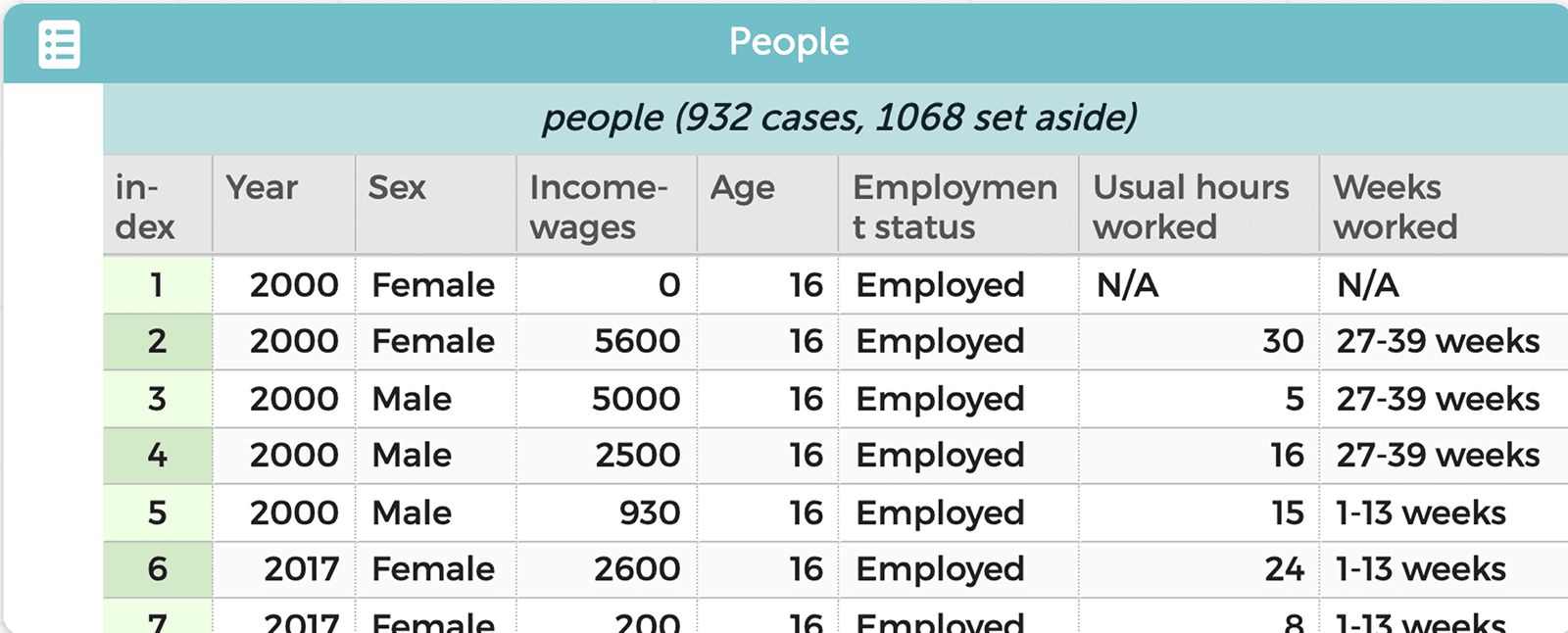
Imagine that you and your students are thinking about income disparities, motivated by news reports on the subject. You start with data from the U.S. Census Bureau’s American Community Survey, which is available at the click of a button through a plugin in CODAP (Figure 1).
Curiosity about the data is the first clue that you’re in a data-rich classroom. Someone asks, “How has income changed since I was born?” or “How different are incomes for females compared to males?” One student comments, “My mom makes more money than my dad, but this data shows that men make more. Why?”
When students make meaning of data—for example, by asking questions and connecting data to its origins and real-world contexts, this is a sign of data fluency.
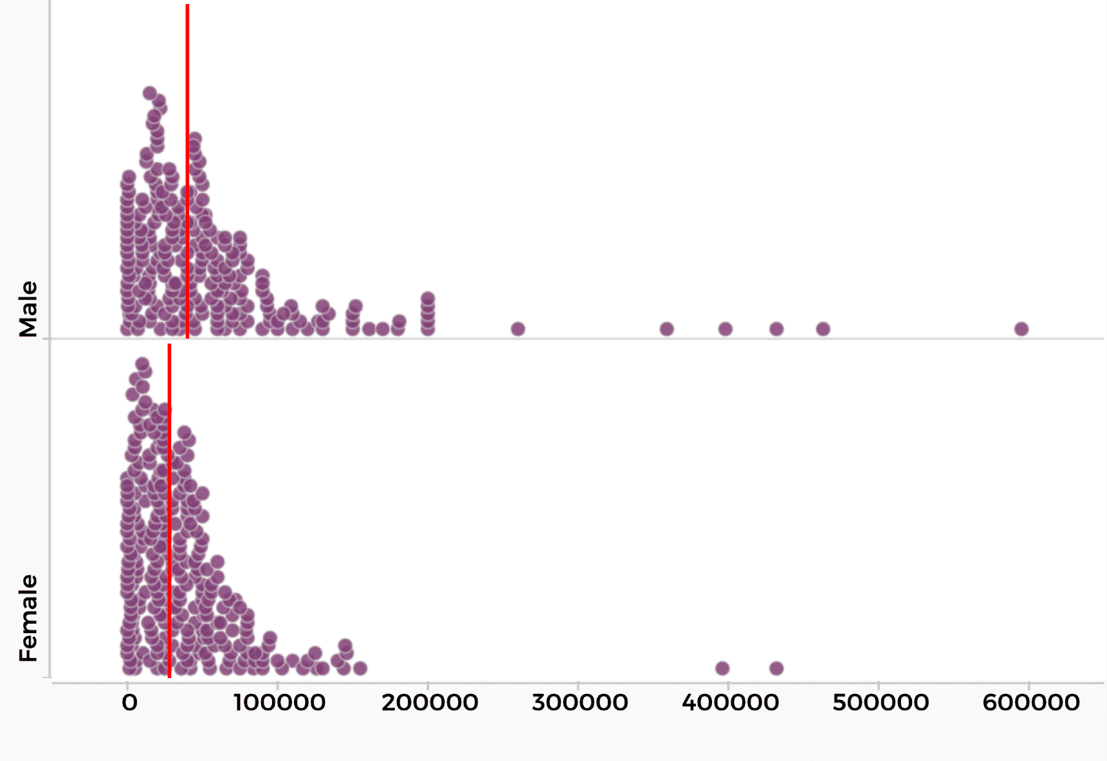
After staring at the table of raw data, your class recognizes this is not a very efficient way to find patterns and anomalies. Students ask if there are any graphs they can look at. In the past, making graphs using paper and pencil or even a graphing calculator often felt like drudgery. Access to today’s data tools changes things dramatically. You ask, “What would you like to make a graph of? What kind of graph might help us answer your question about income differences between females and males?” A student suggests comparing two graphs—income of females and income of males (Figure 2).
When students know how (and when) to transform data and do something with the data to answer a question—for example, by making graphs or other visual representations to reveal meaning from the data, this is a sign of data fluency.
Somewhat surprisingly, in our work with data, we have found that one of the most helpful and revealing questions to ask is “What does this point (on a graph) or row (on a table) represent?” The answer may be a person, a measurement, an experiment, a year, or a field site. Answers to this question often reveal a person’s understanding of the data.
Knowing this, you drill deeper into the student’s observation about their mother making more than their father by asking, “What does each point in this graph represent? Can you find a pair of data on the graphs that reflects this real-life scenario?” As students call out data points, you click on the point in the graph and CODAP simultaneously highlights the corresponding row (or case) in the data table (Figure 3).
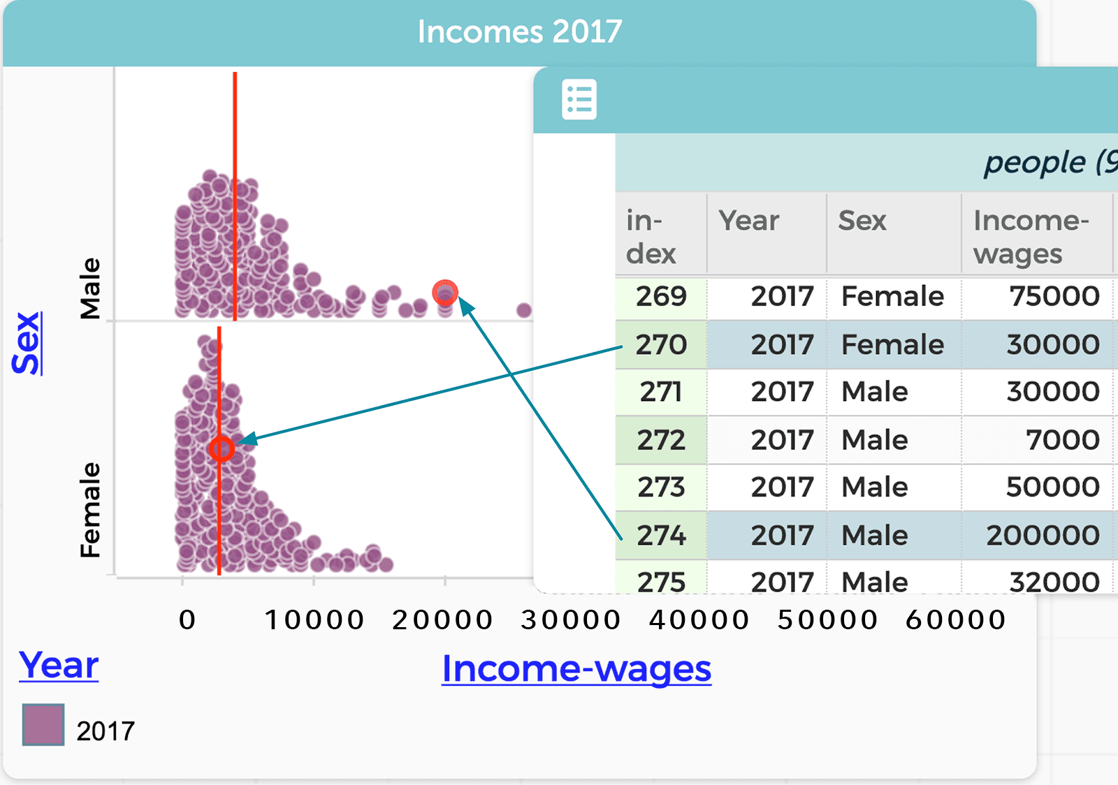
When students can identify connections across data representations—for example, by describing that a row in a data table corresponds to a point in the graph, this is yet another sign of data fluency.
There is much more students can do with the census data to begin to answer their questions. You explain that data is used to model things, usually something in the world. What we choose to record reflects both our understanding of it and the goals of our investigation. For example, a dataset of people with age, sex, employment status, hours worked, weeks worked, and income can be seen as a model for understanding wage inequality. In this way, a data table appears as a rectangle with six columns and hundreds or thousands of rows. We think of this rectangle as a flat model. However, in this situation we can better explore questions about changes over time by creating a “hierarchical representation” in which we create one group for each of two years (Figure 4).
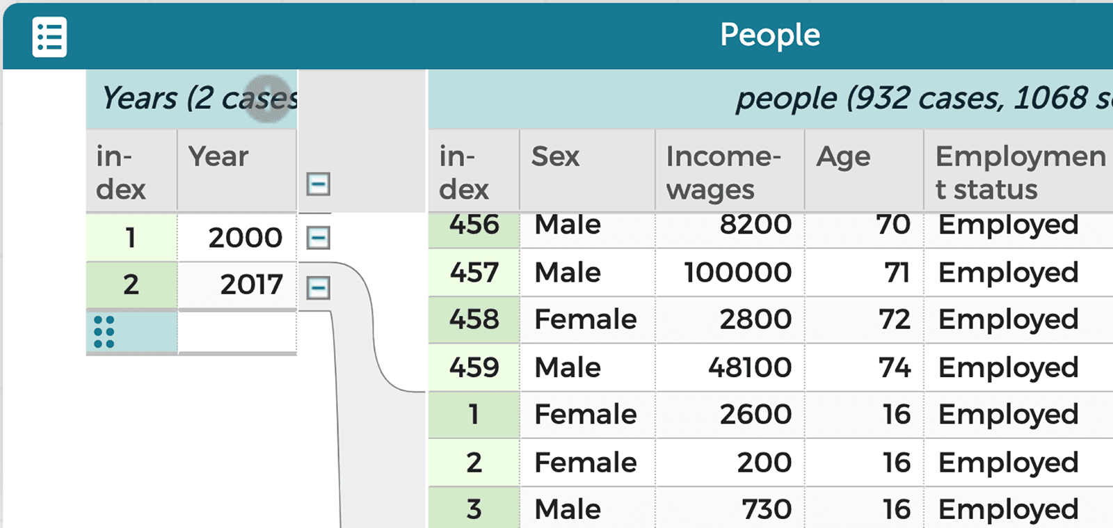
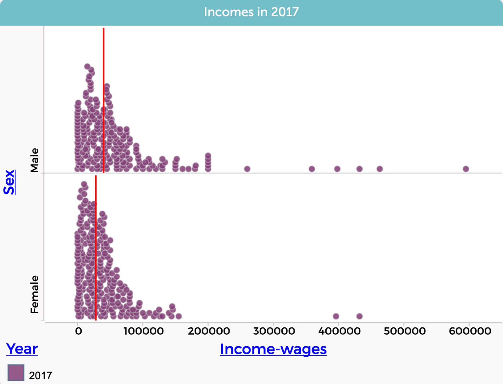
You say, “Let’s go back to our first graph of income inequality from 2017, the most recent year available in the census data.” Then you describe how you made the graph comparing female and male incomes in 2017, by filtering out data about people’s income in the earlier years.
Next, you ask students to work in pairs to figure out what they can do with and to the data to answer other questions, such as “What’s the trend of income inequality over time? Is the gap getting bigger, smaller, or staying about the same?”
When one group calculates the median incomes by writing a formula, they learn that the gap is about $12,000 in both 2000 and 2017.
Seeing this graph, another student asks, “Is there really no change?” You suggest, “What about looking at the gap as a percentage of female income?” With this new challenge, students return to the data and make new graphs (Figure 5).
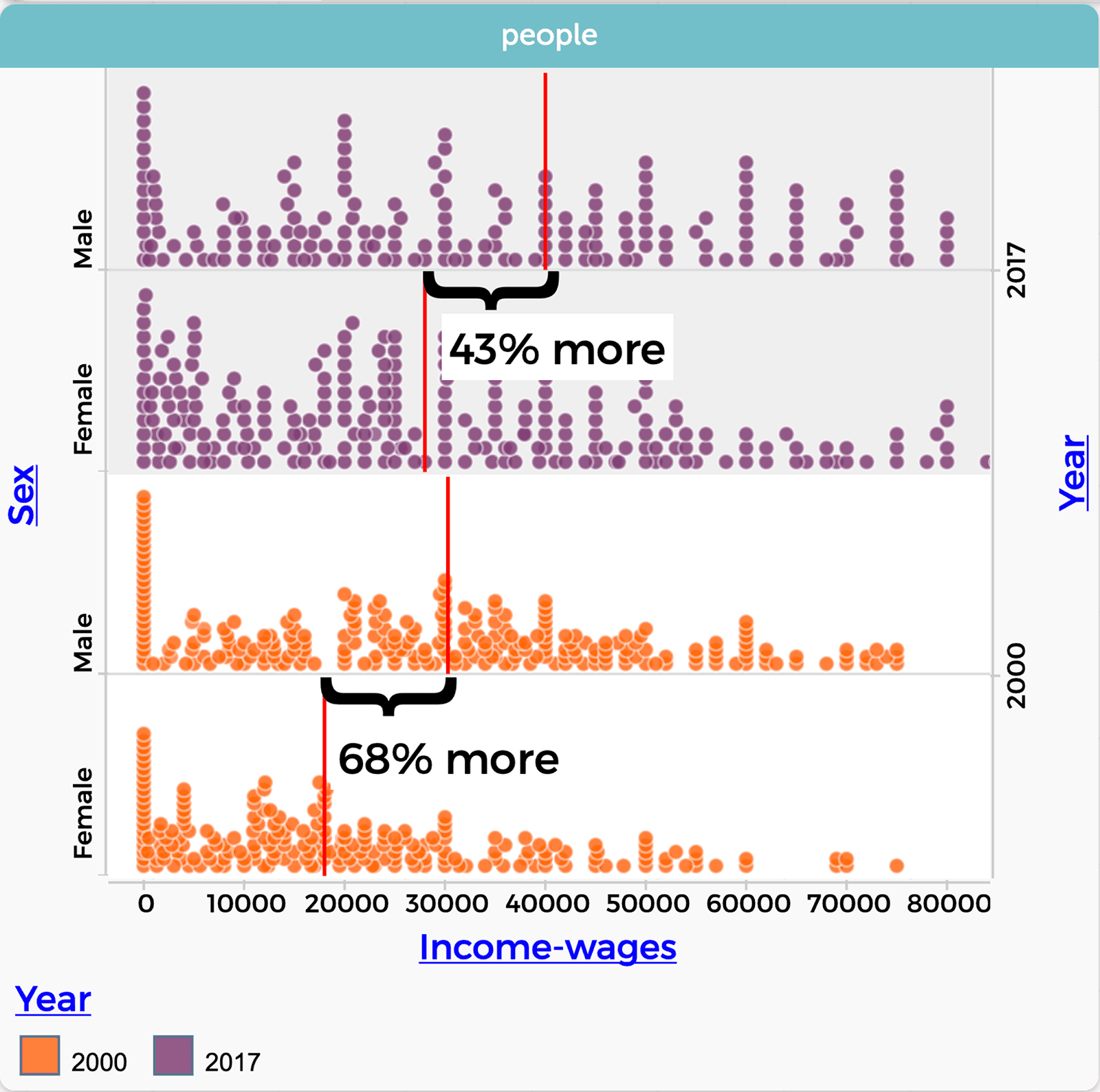
Excitedly, one group exclaims, “The wage gap is going down. Look at this. In 2000 men earned about 68% more than women, but that gap decreased to 43% in 2017.”
When students know how (and when) to manipulate the data to answer a question and do multiple things to the data—for example, by making “data moves” such as filtering, grouping, summarizing, calculating, merging/joining or making hierarchies, this is a good sign of data fluency.
Data fluency prepares learners for the future
We hope that this glimpse into a data-rich classroom offers clues about how to boost data fluency and prepare students for lives in which they make use of data to solve problems and make discoveries. When teachers instill curiosity and excitement about data in their classrooms, they open the door to students’ willingness to ask questions, try new things, think differently, and be bold when using data. Data fluency is an essential 21st century skill.
We invite you to follow our progress and to share your own classroom stories and questions about data fluency.
Common Online Data Analysis Platform
The Next Generation Science Standards (NGSS) and the Common Core State Standards (CCSS) for mathematics both emphasize the importance of analyzing and interpreting data. CODAP is free, intuitive, web-based software designed for students in grades 5 through college to visualize and analyze data. Data from public datasets, experiments, simulations, and more can be imported easily into CODAP for in-depth exploration. A growing suite of tools and plugins allows users to make their own “data moves” to group or filter data, calculate new variables and summary measures, merge datasets, and more. All data representations are dynamically linked in CODAP, so that highlighting a data point in the graph, for example, highlights the same data in a table and a map.
We invite you to build your own data fluency and explore CODAP at codap.concord.org. Click “Open document or browse examples” and select “Getting started with CODAP.”
Continue your data exploration journey with additional tutorials, classroom activities, and discussion forums at: codap.concord.org/for-educators
Kirsten Daehler (kdaehle@wested.org) is director of science and engineering at WestEd.
Bill Finzer (wfinzer@concord.org) is a senior scientist.
This material is based upon work supported by the National Science Foundation under grant DRL-2101049. Any opinions, findings, and conclusions or recommendations expressed in this material are those of the author(s) and do not necessarily reflect the views of the National Science Foundation.