Data Story Bytes: Examining Healthy Food Through Data
Every day, many students and their families make choices about what foods to eat. Families tell stories around the table, including stories about the food they’re preparing and consuming. But what about the food’s nutritional value or its popularity—stories informed by data? The Writing Data Stories project developed curriculum to help students unpack stories about everyday issues like food told through data.
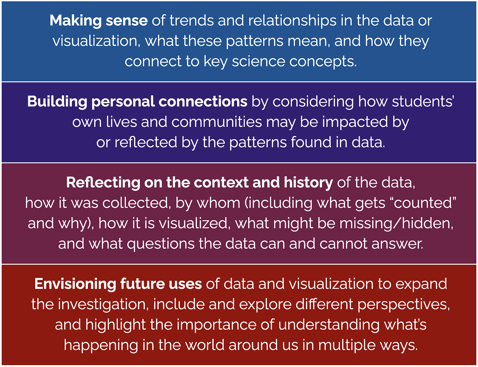
Our goal is to investigate important socioscientific issues such as food, the environment, and climate by analyzing scientific datasets using “data storytelling.” We created curricular activities called Data Story Bytes or simply Data Bytes, intended to be “bite-sized” data activities completed in 30 minutes or less to help students interpret data graphs and visualizations related to various STEM concepts. They are similar to the popular New York Times feature “What’s Going On in This Graph?” and “Data Talks” developed by Youcubed, but are uniquely structured to help frame students’ interrogation of data. Using a four-part questioning framework, students consider where the data came from, who is represented or omitted from the data and other equity issues, and the implications of the dataset for their personal lives (Figure 1).
Data Bytes are available as Google Slides for students in grades 6-12 in different subject areas (e.g., science, social studies, health, math, English, business), and they include directions in both English and Spanish to support multilingual learners. The Teacher’s Guide includes resources for using and creating your own Data Bytes. In this article, we explore one Data Story Byte in detail, taking a bite out of food data in “What’s healthy?”
What’s healthy?
Set the stage by asking students to name foods they eat that they consider healthy or unhealthy, creating two lists on a white board or shared Google Document. Do any students disagree with the foods listed as healthy or unhealthy? Why might people disagree?
Explore the graph
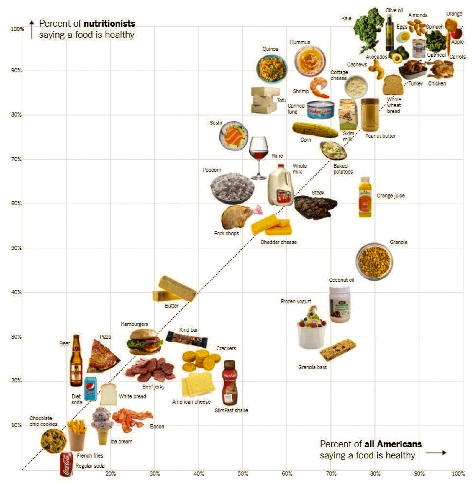
Next, share the graph published in the New York Times article “Is Sushi ‘Healthy’? What About Granola? Where Americans and Nutritionists Disagree” (Figure 2). The graph plots 52 foods by the percent of “everyday Americans” who say the food is healthy vs. the percent of nutritionists who say the food is healthy.

Using a copy of the Google Slide Deck for this Data Bytes activity, ask students to describe what they notice in the graph. Encourage students to look for information in the news article that can help contextualize how and why the data was collected, and from whom.
Use the following questions or develop your own to prompt students to think more deeply about the graph. Encourage students to move beyond the data to connect the patterns they see to their personal lives and communities, to consider what perspectives are included or left out, and to develop new questions. Students can work individually, in small groups, or in a whole class discussion.
Making sense of trends and relationships
What is the first thing you notice or wonder when you see the graph?
Were any foods on our healthy or unhealthy list represented in this graph?
What relationships or trends do you notice?
What does the line represent?
Why are some foods closer to the line than others?
What can you say about foods located above the line versus ones below the line?
Personal connections
What personal connection do you have with the data or patterns in this graph?
Can you locate any foods that you eat? If so, explain where they are located in the graph and the approximate percentage of each group considering it a healthy food.
Where do you think your favorite food might be located in this graph?
Which people or groups do you think would feel more or less of a connection with the data or patterns here?
How might this graph change for people with dietary restrictions?
Which foods are missing that are important to you? Why might they be missing?
Context and history
Who do you think made this graph? Why did they collect this information and create this graph? What did they want to know?
How were the 52 foods chosen for the survey?
What are the strengths and weaknesses of using that method to decide which foods to include?
Who may have been surveyed as part of the “all Americans” group?
Do you think this graph represents foods from a particular culture or a particular part of the world?
How might these patterns be different if the data had been collected about different people or in a different time period?
What might you say about the group of foods towards the lower left of the graph?
How do you think the graph would change if the “all Americans” survey results were replaced with survey results from our class?
Future uses of data
What are some questions you can (or cannot) use this data or graph to answer?
Can you say whether or not your diet is considered healthy based on this graph?
Why might nutritionists disagree about which foods are healthy or not?
What could you do to make this more useful for yourself or others who might not be included? Would you collect more data, or group or graph the data differently?
Do you think there is a relationship between food cost and its location on the graph?
What data would you need to answer that question? How would you collect it?
Extension activities
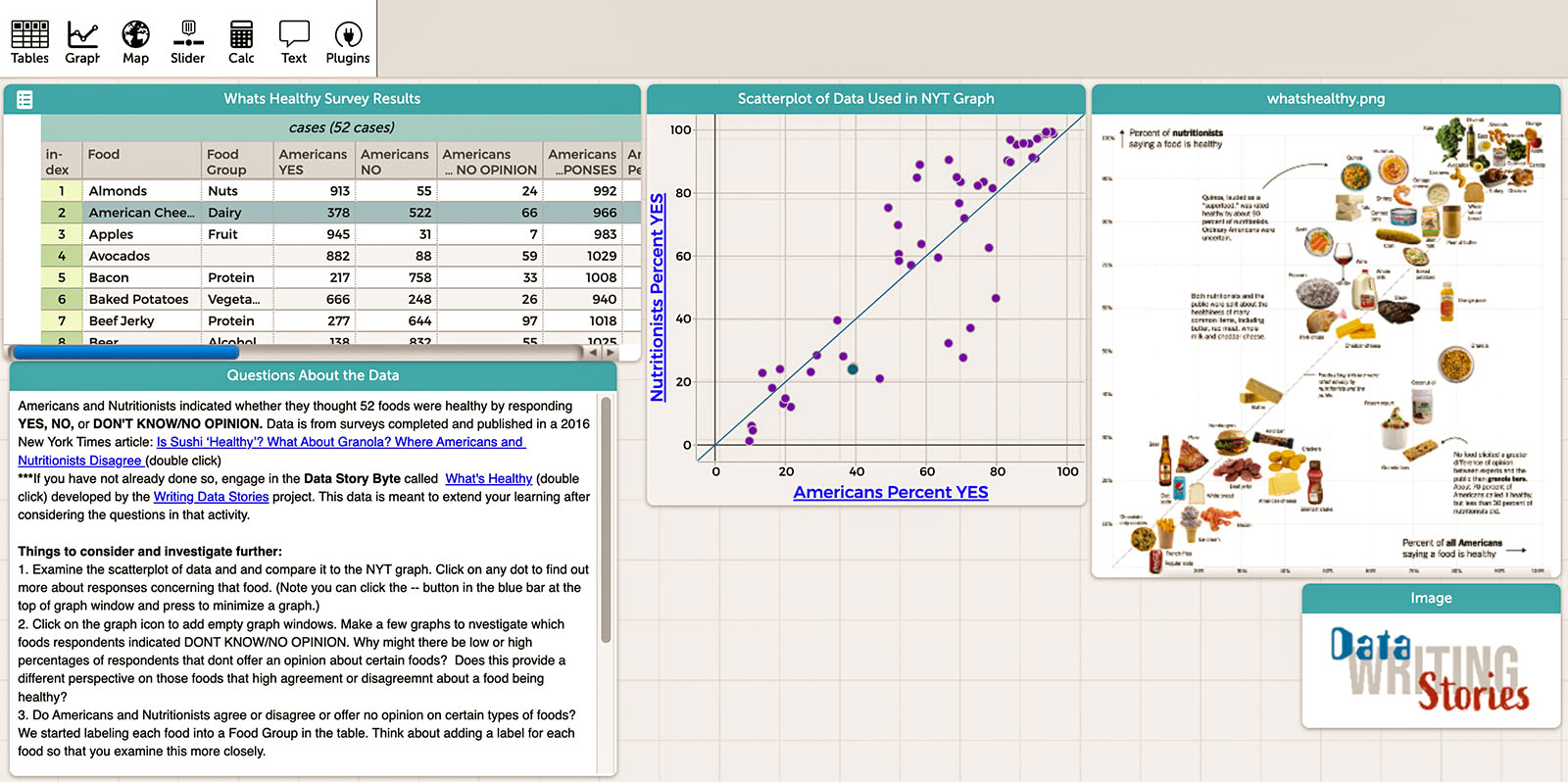
With answers to the above questions as well as new questions inspired by the Data Bytes activity, students make deeper connections between data and their lives. Students can use the Common Online Data Analysis Platform (CODAP) to extend their learning.
The graph focuses on whether nutritionists and “everyday Americans” agreed that a given food is healthy. But not everyone surveyed entered a response for every food, and some people responded “No” or “Don’t Know/No Opinion” for a given food. Explore a CODAP document created from the survey data files linked in the article footnote (Figure 3).
Although 71% of the public rated granola bars as “healthy,” only 28% of nutritionists agreed. However, all granola bars are not the same. Explore a CODAP document with a dataset of nutritional values for 33 different granola bars.
We hope that Data Story Bytes help students critically analyze and interpret data visualizations in ways that connect to their lives and to important issues in society. Perhaps the data will even make for dinnertime conversation about the foods students are eating.
Hollylynne S. Lee (hollylynne@ncsu.edu) is Distinguished Professor of Mathematics and Statistics Education at NC State University.
Michelle H. Wilkerson (mwilkers@berkeley.edu) is Associate Professor of Education at the University of California, Berkeley.
David Stokes (djstokes@ncsu.edu) is a doctoral student in Mathematics and Statistics Education at NC State University.
Bill Finzer (wfinzer@concord.org) is a senior scientist.
This material is based upon work supported by the National Science Foundation under grant DRL-1900606. Any opinions, findings, and conclusions or recommendations expressed in this material are those of the author(s) and do not necessarily reflect the views of the National Science Foundation.