Visual Process Analytics
Analytics has never been more important to our economy than it is today. According to a 2014 article in Forbes, “Business analytics is now nearly a $16 billion business for IBM, on track to reach $20 billion in 2015.” Business analytics research has produced technologies for transforming large quantities of data into meaningful information used for making business decisions or developing business strategies with an unprecedented speed and accuracy.

As learning software that can stealthily log everything students do becomes more popular, education will also become more data-driven. Just as instantaneous business data helps people stay in business, dynamic, fine-grained learning data may help teachers respond to students’ needs more quickly and precisely. But this will not happen without investing in building the cyberinfrastructures, in particular the core engines of analytics that glean learning from data. While IBM’s commitment to business analytics illuminates the possible future of education powered by learning analytics, the sheer scale of IBM’s investment also suggests that such a vision requires tremendous efforts. To this end, the National Science Foundation has funded several projects at the Concord Consortium to conduct basic research in this field. This article introduces Visual Process Analytics (VPA), a data mining platform developed by some of those projects to support educational research and assessment based on analyzing and visualizing process data collected by sophisticated learning software.
“New technologies thus bring the potential of transforming education from a data-poor to a data-rich enterprise. Yet while an abundance of data is an advantage, it is not a solution. Data do not interpret themselves and are often confusing—but data can provide evidence for making sound decisions when thoughtfully analyzed.”
— Expanding Evidence Approaches for Learning in a Digital World,
Office of Educational Technology, U.S. Department of Education, 2013
The DRIP Problem
One goal of VPA is to create a platform for tackling the DRIP (“data rich, information poor”) problem, a central challenge in leveraging large amounts of computer-generated student data to improve education. The DRIP problem worsens when learning becomes more open-ended because: 1) the supporting software can generate more types of data as students explore more variables, 2) wider and deeper exploration can take more time and, therefore, produce more process data, and 3) indicators of unbounded learning are more complex to define and more difficult to find.
Open-ended inquiry and design activities are key to learning the science and engineering practices promoted by the Next Generation Science Standards. Students’ “microscopic” action data logged by the supporting software during these activities, however, often appear to be so noisy that finding any order in them becomes a daunting task. Without tools that can reveal patterns in the data, researchers and teachers get nothing but a DRIP problem.

The Visual Process Analytics Platform
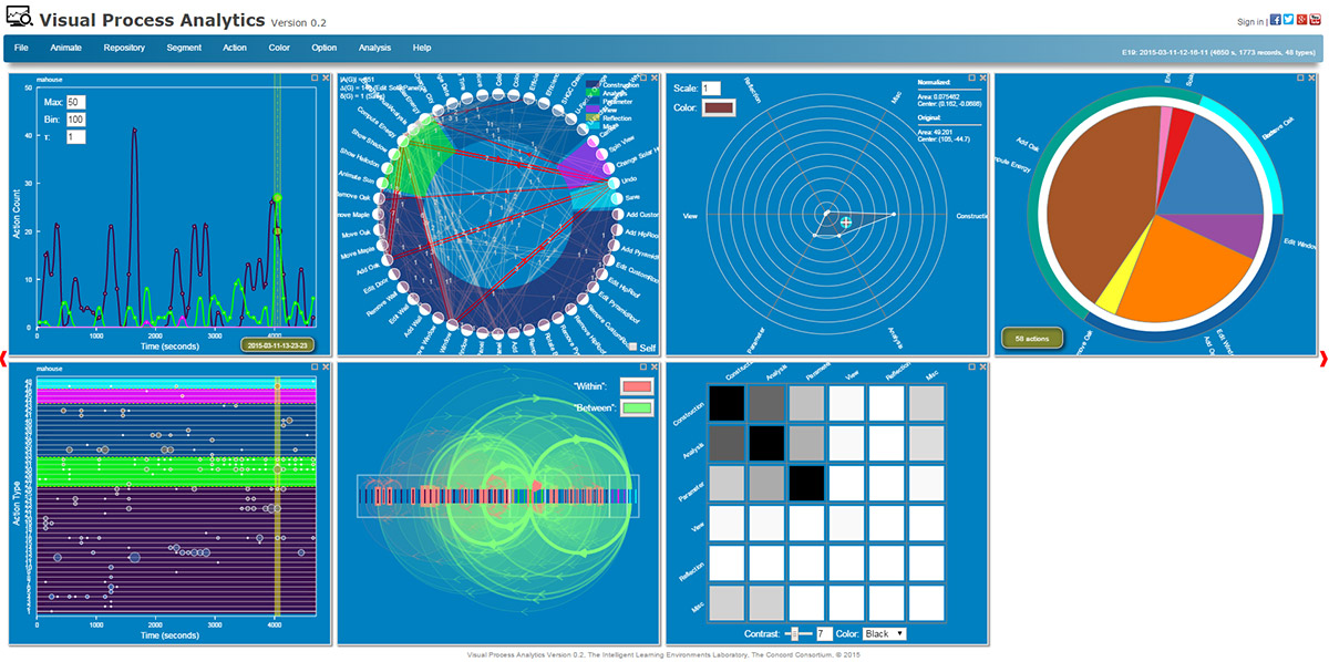
Our ultimate goal is to equip teachers with informatics and infographics for monitoring student progress and assessing their learning anywhere, anytime. For this purpose, we created VPA as a Web app that teachers can access from any device. VPA can load a data set from an online repository or from a hard drive. Although it currently serves only our own data repositories with student data from engineering design and mixed-reality activities, VPA is intended to be a generic platform for process mining and visualization. VPA is able to recognize a JSON data set that encodes student activities, provided that the data set is formatted as a stream of timestamped JSON objects and a schema that defines the tags and attributes of the objects is given to configure it. Like business analysts who use online analytical processing (OLAP) tools to analyze multidimensional data interactively from multiple perspectives, educators can use VPA in similar ways: 1) roll-up allows users to aggregate and analyze learner data in different dimensions, 2) drill-down allows users to zoom into and navigate through the details, and 3) slicing and dicing allows users to extract a subset of data and visualize it differently. In addition to the OLAP features, the VPA platform is supported by six pillars (Figure 1)—software modules that perform various kinds of visualization, analysis, and management of data. Interactive visualizations are fundamentally important to VPA because: 1) a picture is worth a thousand words, 2) humans are often more capable than computers of recognizing complex patterns in pictures, and 3) interactive graphics provide more dimensions for exploring data than static graphics.
Under the Hood
Data Structures
Since real learner data are often multi-faceted, data fed to VPA are first sifted into different types of data structures, each representing a different mathematical view of the data. For instance, a sequence of action data can be stored and treated as a time series (an array of numeric data collected over time) that describes when different types of actions occurred with what results on which objects, or as a directed graph (a network of nodes linked by arrows) that describes the transitions among different actions and tasks. Each type leads to a different way to think about the data, enabling various visualization and analysis methods to be developed.
Visualizations
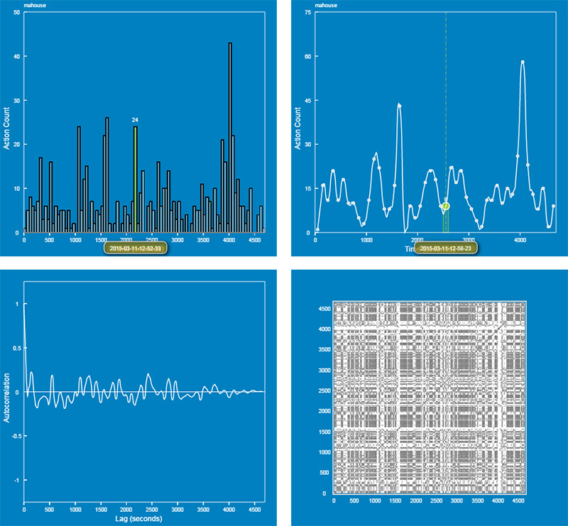
Scientific visualizations are powerful because they help people make sense of data by rendering salient, intuitive pictures of the data being examined. The multi-faceted nature of data suggests that a single type of visualization may not suffice to represent a data set. This is why VPA provides multiple visualizations to create a more holistic view. Seven types of visualizations—time series, directed graph, radar chart, pie chart, scatter plot, linkograph, and heat map (Figure 2)—are currently available, each depicting a unique aspect of a data set. Interactive and customizable, they allow users to examine data more flexibly. Each type also provides several options. For example, a time series can display as a histogram, a curve, a correlogram, a periodogram, a recurrence plot, and more (Figure 3).
Interactions
Like other visual analytics software, VPA provides a rich, interactive user interface for analyzing and viewing data. The graphical user interface for each visualization tool is dynamically generated based on the chosen settings. For example, to capture overall patterns in a time series, users can increase the width of the time bin to smooth the time series curve as necessary. Throughout VPA, tool tips with more information about the data pop up when users mouse over hot spots of the visualizations. Users can even take advantage of the temporal nature of the data to animate a visualization to further enhance the visual effects.


Algorithms
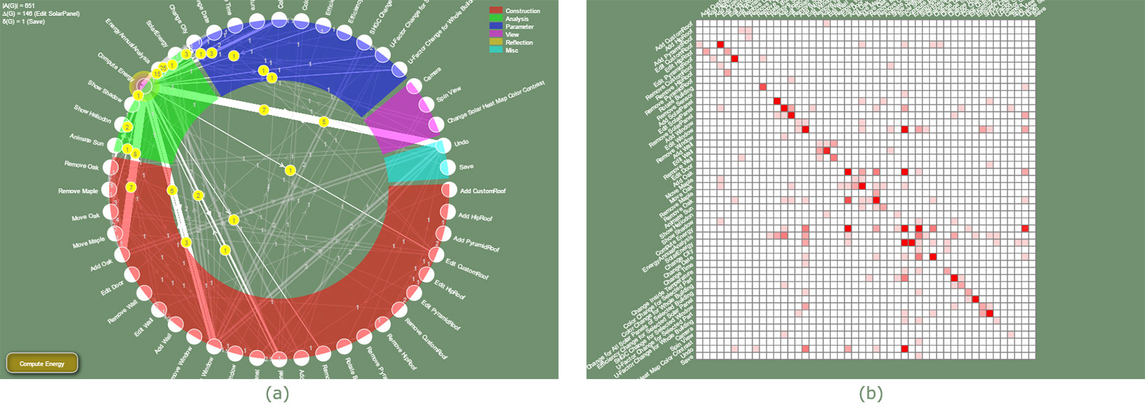
By manipulating the visualizations, users develop basic ideas about the data. But they need deeper analyses to reveal hidden patterns. VPA provides a growing set of algorithms for in-depth analyses. For instance, VPA employs time series analysis when the data are viewed as time series and graph theory when the data are viewed as graphs. Autocorrelation and cross-correlation functions in time series analysis can be used to search for patterns of iteration, correlation, or causality. These algorithms work as if we print two time series on transparency films, overlay them, and then manually slide them horizontally to search for similarities or correlations. Within the framework of graph theory, on the other hand, any process of interacting with software can be viewed as a directed graph that connects all actions with arrows that represent transitions (Figure 4a). Once the process data are coded in this way, VPA computes its properties and visualizes its adjacency matrix with a heat map that makes the high-frequency transitions clear (Figure 4b).
Models
One of our research goals is to model complex cognitive and learning processes so that we can describe, classify, or even predict student behaviors. For this purpose, we include tools for fitting the data with statistical models. For example, the autoregressive integrated moving average (ARIMA) model in time series analysis may be used as a general model to probe the degree to which a student’s action was influenced by previous actions. The results can be used to gauge how autoregressive or iterative the process was.
Management
VPA includes many features designed to facilitate data mining, including:
- Browsing. VPA is a data browser—users can browse a data repository using arrow buttons or jump to a data set using drop-down menus for selecting classes, students, and segments. Every time a new data set is loaded, VPA automatically updates all the visualizations on the screen.
- Persistence. A state of data mining in VPA is called a perspective. Users can save perspectives as files to keep track of their work, compare multiple views, document a finding, or continue the analysis later. In addition, VPA remembers the last perspective— when users return, VPA comes back to the exact point of analysis where they left.
- Output. VPA results can be exported as data or image files that can be further analyzed or displayed using other programs.
The Future
Launched only a few months ago, VPA is in its infancy. Its current form is more suited for researchers than for teachers. But we hope to develop a recommendation engine that digests low-level data and outputs high-level information to teachers through a series of dimensionality reduction. We envision a future in which every classroom is powered by more advanced VPA-like informatics and infographics systems that support day-to-day teaching and learning using a highly responsive evidence-based approach. At a time when business runs on analytics rather than opinions, it is not fair that teachers have to rely on simple hunches or scarce information about their students’ learning processes to teach. The research that we are undertaking is paving the way to a future in which teachers are empowered with tools on par with business analytics.
Charles Xie (qxie@concord.org) is a senior scientist who works at the intersection between computational science and learning science.
This material is based upon work supported by the National Science Foundation under grant DUE-1304485. Any opinions, findings, and conclusions or recommendations expressed in this material are those of the author(s) and do not necessarily reflect the views of the National Science Foundation.

