Monday’s Lesson: Immigration Data and the Great American Melting Pot
Middle school students typically study the immigration experience of the tumultuous 20th century and its impact on American policy in their social studies class, often using photos and written accounts as primary sources. Data can also serve as an engaging primary source. Data science is an inherently interdisciplinary field, allowing students to make connections between humanities, math, and issues of community interest.

This lesson is useful when studying U.S. immigration policy in the late 19th and early 20th centuries, the reasons for immigration, and the stories of immigrant experiences at both Ellis Island (New York) and Angel Island (San Francisco). Consider including discussions around the Chinese Exclusion Act and the 1924 Immigration Act. While you can start this lesson on a Monday, plan for three to four class periods to finish.
The hook
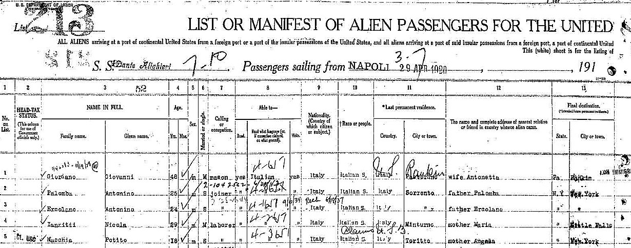
Show your students an image of a ship manifest from an arrival at the Port of New York (Figure 1). Then guide students through a conversation about what counts as data in social studies. (Students might consider, for example, immigrants’ arrival date, country of origin, or nationality.)
Introduce the data
Now show a screenshot of the same information from a ship manifest, this time displayed as a table in CODAP (Figure 2). Ask students: What do you notice? What do you wonder?

(1906–1940).
As students share what they notice and wonder about the manifest, guide their attention to the column titles. These are the data attributes. Additionally, if not mentioned by a student, point out that some people traveled beyond the U.S. (their final destination is outside the U.S.). To encourage students to wonder about different travel experiences, choose one data case (row) and ask what it might have been like to be that person. How old were they? Were they traveling alone or with their family?
Explore immigration trends
Working in pairs, students should open the Ship Logs Sample CODAP document (http://short.concord.org/m0x) and explore the dataset.The goal is to identify similarities or differences between people arriving in New York City and those arriving in San Francisco. For example, click the Graph button in CODAP, then drag the Arrival Port attribute to the y axis and the Arrival Date to the x axis. Continue making additional graphs. Note: Students can save their CODAP documents to Google Drive or as a local file.
Ask students: What did you learn from graphing these attributes? Does the graph show a similarity or difference between immigration to New York and San Francisco? Why do you think a similarity or difference exists?
Tell an immigration data story
Students should use their data exploration to support a story about immigration. Click the Plugins menu in CODAP and choose Story Builder, then click the question mark in the upper right for a short tutorial. (Alternatively, students can use Google Slides or another presentation format.) Students’ data stories should be supported by graphs from the dataset and include an answer to one or more prompts:
- Who immigrated and to where?
- Why did people immigrate? Was there a difference between Asian and European immigration?
- When did people immigrate? How did laws and world events
impact immigration?
Through data storytelling, students can enhance their critical thinking, research, and analytical skills in humanities classroom and beyond.
Rachel Folger (RFolger@schools.nyc.gov) is a middle school social studies teacher in New York City.
Kate Miller (kmiller@concord.org) is a research associate.
This material is based upon work supported by the George Lucas Educational Foundation and the National Science Foundation under Grant No. DRL-2200887. Any opinions, findings, and conclusions or recommendations
