Monday’s Lesson: What’s So Smart About a Graph?
Your students are about to use an electronic temperature or force sensor, perhaps for the first time. The data will be displayed in a real-time graph. What is the best way to help your students make sense of the data?
An experiment using a sensor has at least four simultaneous representations:
- The story of what was done (the experimental procedure).
- The shape of the curve (the appearance).
- The x and y values at each point (the numerical values, sometimes shown in a table).
- The equations the data represents (the mathematical description).
An experienced scientist is aware of all four at once, jumping back and forth between representations with ease. But for students, connecting these representations takes considerable effort and practice.
We developed “smart graph” capabilities to help these students. A smart graph “knows” about its own features and can help you investigate it. A smart graph can check your interpretations based on your answers to questions. It can highlight a portion of the graph, confirm your answer, prompt you to try again, describe what you should look for, or explain how to calculate something. Your answers might be labels added to points on the graph, numerical values, or actions, such as rescaling the graph.
Challenge 1: How was this graph made?
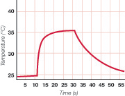
We have applied the smart graph feature to pre-determined sample datasets similar to the results of an experiment students might try. This gives them a preview of what might appear when they create their own data. For example, students see the graph above.
The story:
I held the sensor in the air. Then I squeezed the sensor between my fingers for a little while and let it go.
The appearance:
The graph starts roughly level, then increases quickly and levels off. It drops off more slowly and gradually reaches the original value.
The numerical values:
Room temperature is about 24.5oC, rises to about 35.5oC between 20 and 30 seconds, then drops back to room temperature over 50 seconds.
The equations:
There are two logarithmic response curves, one upward and one downward, with unequal response times.
To help students connect these representations, they are asked to answer these questions:
- Put a label on the part of the graph that measured room temperature.
- What was the temperature in the room?
- Put a label on the graph when the student touched the sensor.
- How long did the student touch the sensor?
- What was the temperature of the student’s finger?
After each response or action, the student clicks a “check answer” button and learns if she is correct. If not, a hint appears. If, on second try, she is still not right, a second more explicit hint is displayed or the graph is highlighted on the pertinent part.
For example, Question 1 might offer the following prompts:
- (The student does nothing.) “Use the label tool to add a label to the graph.”
- (The student labels the wrong part.) “That’s not correct. What part of the graph shows room temperature, before the student touched the sensor?”
- (The student again labels the wrong part.) “That’s still not correct. Add a label to the highlighted part of the graph.” (The correct region of the graph is highlighted.)
For Question 2, the smart graph looks for numbers:
- (The student enters the wrong value.) “That’s not correct. Read the temperature at the beginning of the graph on the y-axis to the left.”
- (The student again enters the wrong value.) “That’s still not correct. Read the temperature of the highlighted part of the graph.” (The correct region of the graph is highlighted.)
For advanced students, more subtle interpretations could be explored:
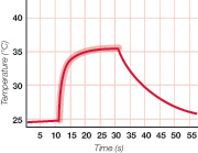
- “What was the fastest rate of increase?” This could involve expanding the scale and finding slope just after the student touched the sensor.
- “What is the shape of this portion of the graph?” (The relevant region is highlighted.) Relate the shape to the physical situation: the rate of change is proportional to a difference.
Challenge 2: Interpret force data
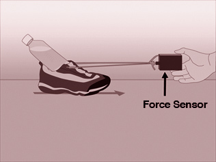
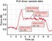
In another experiment, a student pulled a shoe with a force sensor. He pulled gently at first, then harder and harder until the shoe started to slide. The student then tried to pull it at a constant speed, and finally stopped pulling (see figure at right).
As the teacher, you might ask your students to respond to the following:
- Add a label where the shoe started moving.
- Add a label where the shoe was being pulled at a constant speed.
- What was the force needed to get the shoe moving?
- What was the average force needed to keep the shoe moving?
After the questions have been answered, the graph might look like the one to the right.
The smart graph checks that each label is in the correct place.
The connection between the story and the graph requires an understanding of physics. For instance, did the shoe start to move when the force went above zero (2 seconds), when it reached a maximum (3.2 seconds), or when it reached a constant value (3.5 seconds)? Why is there a bump before the leveling out at about 1.0 N? When the data is noisy, how do you find the average? If another surface material is used, how will the graph change? A real-time graph allows you to experiment with and talk about these questions; a smart graph can help you do that on your own.
The future of smart graphs: how smart will they get?
With pre-recorded data, it’s not difficult for the graph to be smart about itself. The author of the activity enters the proper values or ranges when composing the “check answer” responses. With real data, composing useful responses is more difficult, and also more interesting.
In order to take the next step and respond to real data, the smart graph needs additional capabilities:
- Smooth the data, so that maximum, minimum, averages, and slopes can be calculated more easily.
- Find averages and slopes in regions marked by the student.
- Identify regions with different types of curves, such as constant, increasing, or decreasing slope.
There is also great potential in having the smart graph display the output of models, such as Molecular Workbench and NetLogo.
Graphs contain an enormous amount of information, making them very rich and interesting tools for understanding. In each situation, what should be noticed and interpreted—and what can be ignored—is different. This is a challenge for the author of the smart graph questions, but it’s also why this capability is so useful for teaching. Understanding graphs is a fundamental part of scientific literacy. Smart graphs may make your students smarter about graphs—and science.
