New Data Types and New Data Interfaces
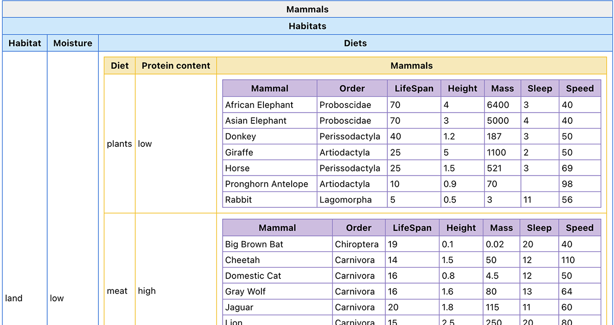
Multidimensional data: Thinking outside the “table box.” Understanding the structure of an unfamiliar dataset can be challenging. While data are typically formatted in a two-dimensional “flat” display with rows of data for each item and columns representing data values or attributes about the items, this ubiquitous display is not as simple cognitively as it may seem at first.
Even relatively modest datasets can be organized or grouped by more than two attributes. Imagine a CDC dataset on vaccinations with five attributes presented by county. Depending on the question of interest or the user’s perspective and preference, this dataset could be reorganized by state or categorized by ranges of the social vulnerability index. Such “nested” data structures transcend the confines of two-dimensional data tables, and working through potential restructurings places high demands on both the cognitive resources of learners and the flexibility of existing interfaces.Although students possess an intuitive understanding of hierarchical or nested structures, current technologies do not provide them the ability to represent these structures in useful and flexible ways.
In our Supporting Reasoning with Multidimensional Datasets project, we’re working to identify how students represent, interact with, and make sense of multidimensional data, and to investigate how novel representations and interfaces can support them in sense-making and reasoning. We aim to help learners better understand dataset structure and ultimately promote the development of students’ robust, flexible mental models of data.The exploratory interfaces we are designing within CODAP (Figure 1) show promise for helping students make sense of multidimensional data.
Spatiotemporal data: Exploring a new frontier. From climate concerns to public health needs to global issues across political or economic spheres, society’s biggest dilemmas and our greatest opportunities involve interpretation of spatiotemporal data, data that vary across both space and time. However, such data pose myriad cognitive and technical challenges.
While techniques for analyzing either spatial or temporal data alone are established and robust, the overlap between attributes of space and time confounds even technical researchers in domains that depend upon these data—the first paper on big spatiotemporal data appeared in scholarly journals just over a decade ago.With that backdrop, we are pioneering work to understand how to aid learners in understanding and effectively exploring spatiotemporal data.
| Spatiotemporal data type | Data source/structure | Real-world applications |
|---|---|---|
| Event data | Measurements reporting point locations with associated timestamps | Crime, epidemiology, traffic accidents, social network activity |
| Trajectory data | Data from paths traced by bodies moving in space and time | Urban traffic, human mobility studies, animal habitats/ranges |
| Point reference data | Moving-reference-point measurements of a continuous spatiotemporal field | Weather balloon traces, sea surface measurements |
| Raster data | Fixed-location-and-timepoint measures of a continuous or discrete field | Climate, neuroscience, and transportation studies |
Through our Data in Space and Time project, we’re conducting foundational research and development into how learners take in spatiotemporal data, and developing novel interface designs for spatiotemporal data exploration. We’ve begun by examining the different types of spatiotemporal data and conducting early research to understand how learners approach data of different types (Table 1).
There are many different types of spatiotemporal data. This complication adds new challenges to designing appropriate interfaces.As shown inTable 1,data from individual events is fundamentally different from data representing a variable changing continuously across a map or data showing trajectories of multiple objects over time. Each data type corresponds to different real-world problems, and each holds its own questions for cognitive interpretation, interaction, and exploration.
Some of the most interesting questions, however, lie in what’s not yet understood because it can’t currently be explored. Imagine, for example, attempting to answer the question of when and where similar weeklong dips in surface water temperature have occurred across locations in the Gulf of Maine over twenty years. Or envision trying to explore which of a series of fifteen socioeconomic and environmental factors contribute most prominently to heat index-related medical admissions across a city over a decade. Answering such questions forms the core of dozens of present and future careers, yet current interfaces barely support their exploration. We aim to combine our research with related research on user interface design to develop novel technologies for data exploration. We also want to study how new visualizations can aid learners in approaching and identifying patterns in spatiotemporal data.
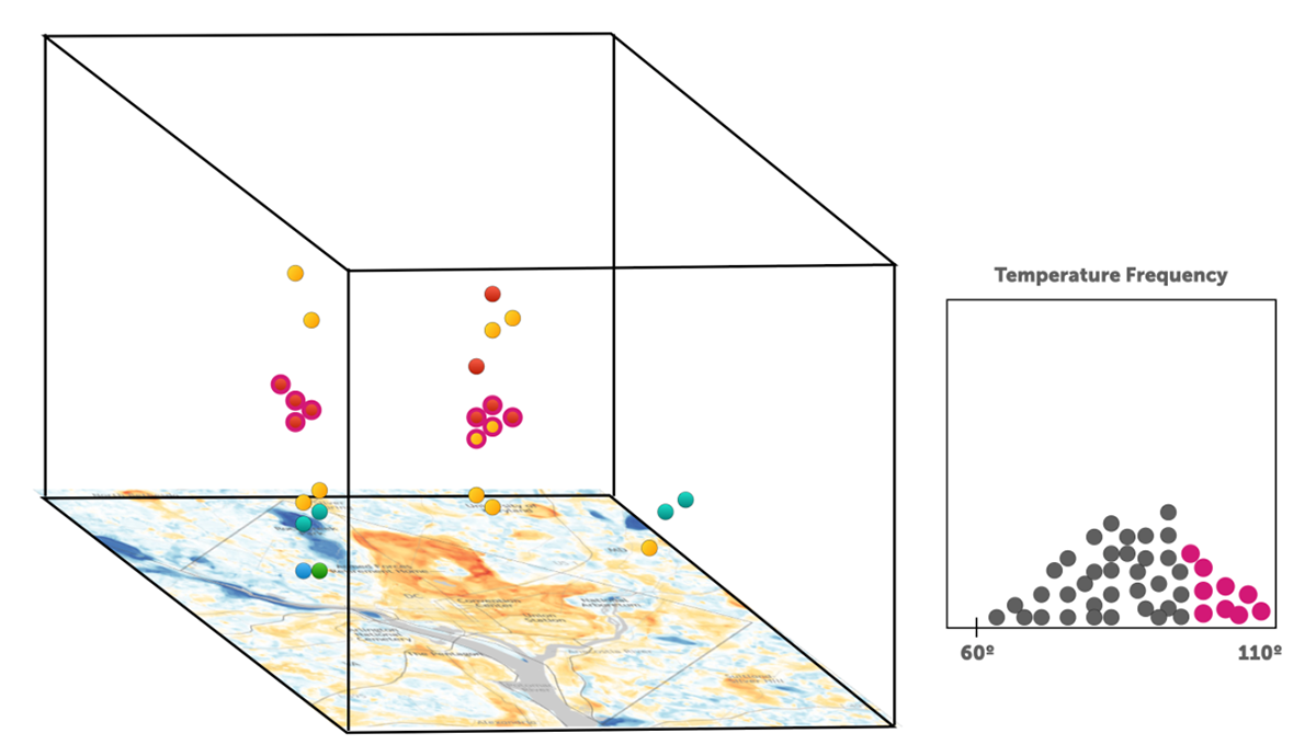
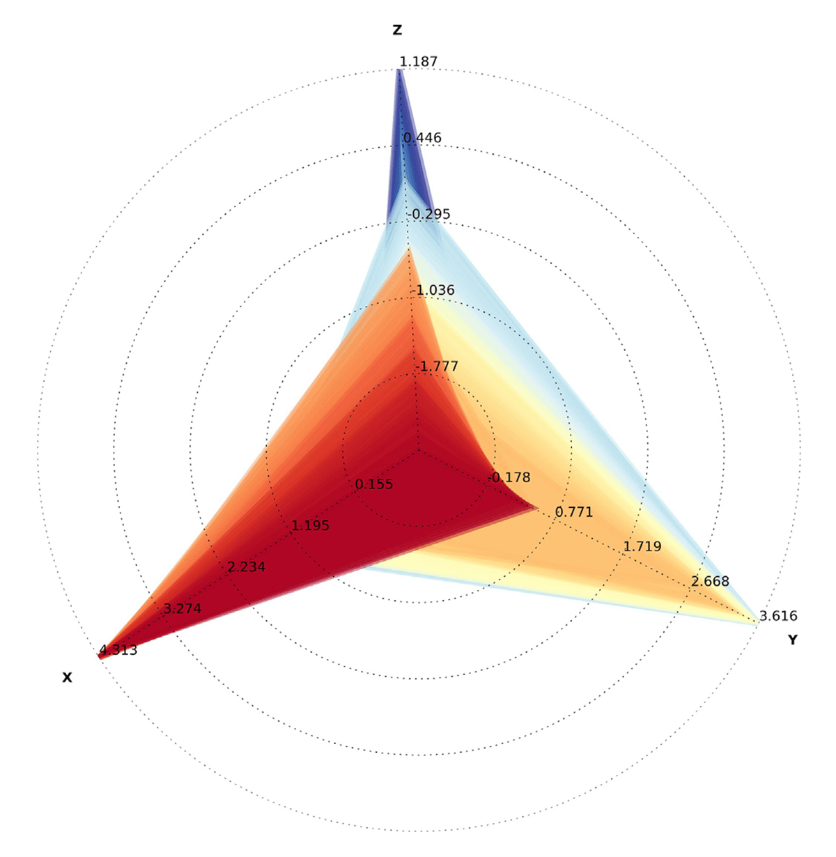
For example, consider data generated from discrete events.In such datasets, time adds a third dimension to the data that locate an event’s position on an x-y coordinate plane. Researchers have experimented with representing time as a third dimension in the z-axis via prototype interfaces such as the space-time cube (Figure 2). Events occurring at specific map locations hold additional information about the time associated with the event. Tilting and rotating the space-time cube reveals this time coordinate and makes it possible to explore the data from multiple angles.
By pairing such an interface with CODAP’s built-in ability to highlight selected subsets of a dataset across multiple representations, we want to understand how to help learners uncover new patterns in event data. For example, students might highlight the most extreme heat events in a city’s history and observe where and when the highlighted data cluster together or see that certain locations exhibit more clustering in space and time than others. Or they might be able to move a 2D map layer up and down along the cube’s z-axis to easily identify the geographical locations where time-event clusters occur.
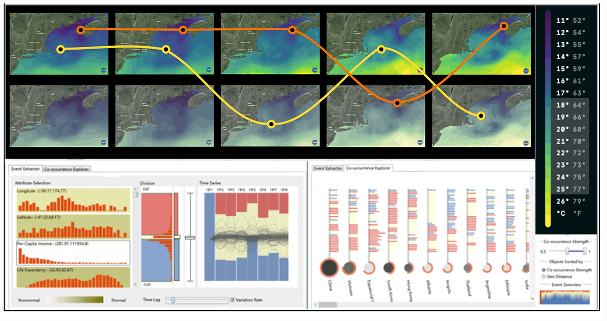
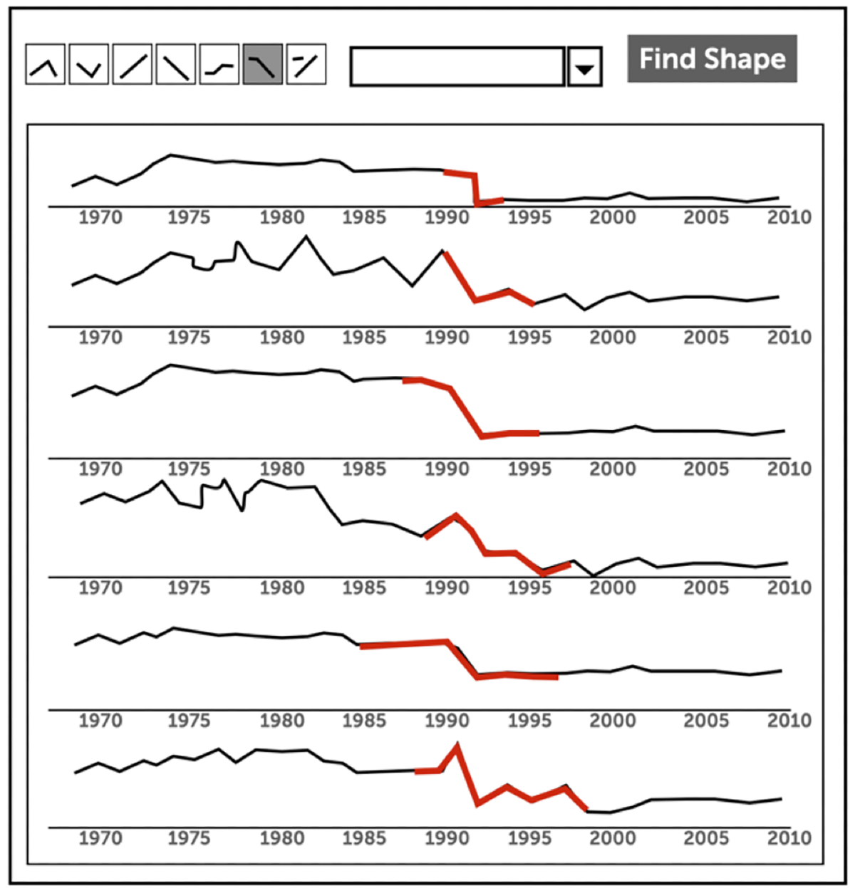
For other data types, such as raster data, or combinations of data types, we’re researching new interfaces that will allow learners to explore multiple points on a map simultaneously. As Figure 3 shows, such interfaces will ultimately help learners identify correlations between dispersed patterns occurring at different locations or trace phenomena as they evolve across both space and time. Additional interfaces, supercharged by AI’s capabilities, will allow for exploration currently only in the realm of imagination.We envision a “shape search” feature that allows learners to ask,“When and where has a similar shape occurred?” With such a feature (Figure 4a), learners might search for surprising temperature drops, data spikes, or U-shaped data trends across decades of historical data as easily as we search for text terms in a PDF file today.
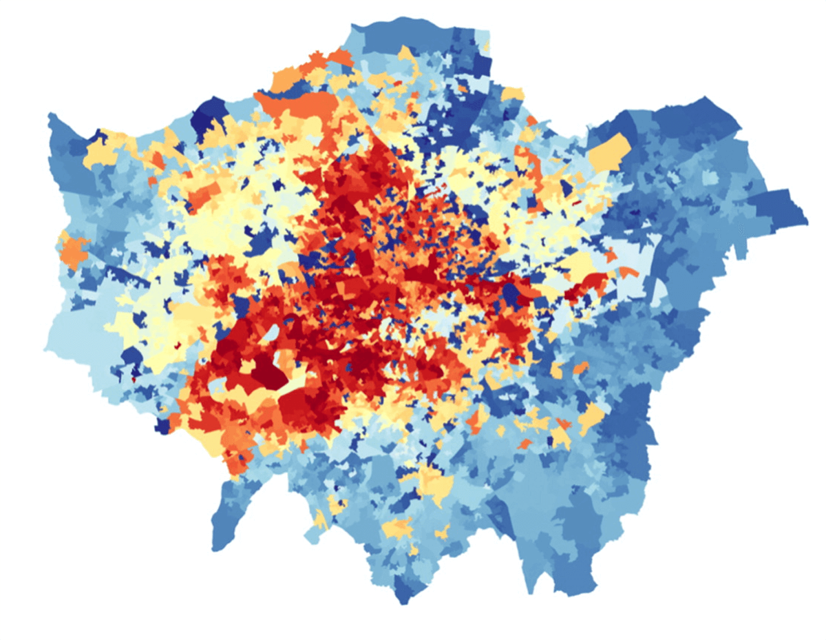
AI technology also will allow us to collapse data from highly multivariable datasets intelligently into “super-hotspot” maps that show not only regions and clusters of geographical interest, but depict them clustered in correlation with each other. With such a tool (Figure 4b), learners could choose a handful of attributes of interest from dozens of columns in a public dataset spanning economic, social, and weather factors, and immediately see the geographic confluence of complex socioeconomic factors, temperature, and public health factors when added to a map.
Sonifying data: Adding accessibility for all. One of the most significant needs in data science education involves accessibility of data for learners with differing abilities. Blind and low-vision learners currently have practically no tools designed to support them in understanding and exploring data. Further, 75% of blind and low-vision learners are more than one grade behind their sighted counterparts in math and 20% are over five grade levels behind their peers.
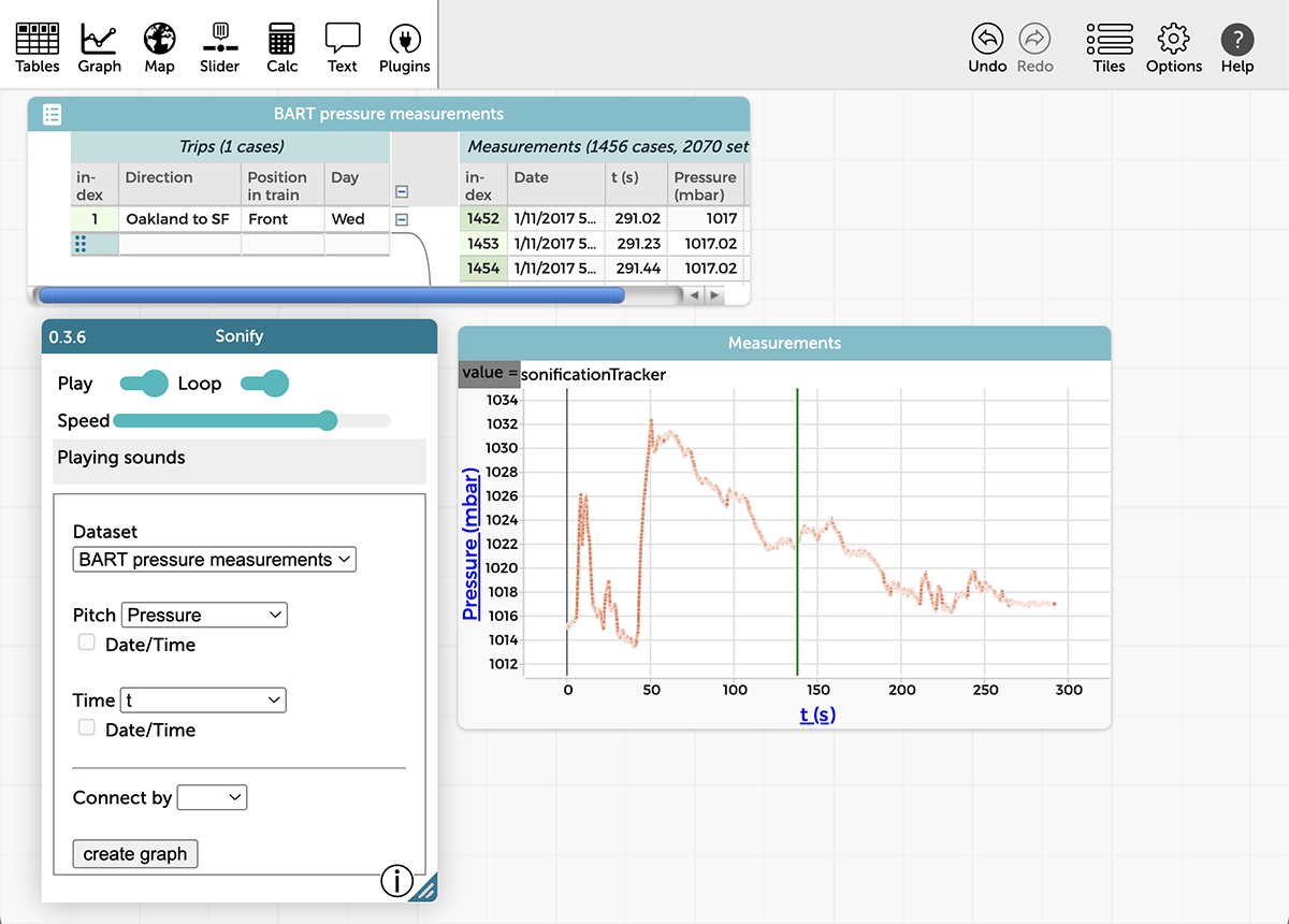
To reach underserved learners and offer new ways of learning for all, we are exploring the potential of data sonification, adding audio information to data. With partners at Tumblehome Learning, we have developed interfaces for data sonification within CODAP. We are now researching the extent to which linking visual representations with sonification can help students learn the basics of time-series graphs in more engaging and effective ways.
(a)
(b)
San Francisco.
As shown in Figure 5, the sonification interface allows learners to select one or more variables within a dataset to explore via sound. By tying one attribute to the pitch of a sonified representation and another to the timed aspect, they can hear a scatterplot as a rising or falling set of multiple pitches and listen for the connection across variables. By selecting a single attribute for both, students can hear the shape of a bell curve or bimodal frequency distribution highlighted as regular variations in sonified output.
Perhaps the most interesting aspect of sonification lies in its capacity to extend our ability to explore data overall. Universal design solutions that serve one population often can serve many others. Discriminating pitch and time intervals using our innate auditory capacity can enable users to uncover surprising patterns or outliers that traditional data visualizations would otherwise obscure.
Our work is forging new ground and opening up completely new areas of research and development for new tools and new affordances.We will be sharing our results and publishing our tools as open-source software in order to inspire others.Today’s youth need access to tools for learning and working with data that correspond to the challenges and opportunities they will face. By developing research-based solutions to these fascinating learning challenges, we’re guaranteeing that the solutions available to them are up to the task and based on the best evidence available.
Gregory, M., & Shneiderman, B. (2012). Shape identification in temporal data sets. In J. Dill, R. Earnshaw, D. Kasik, J. Vince, & P. C. Wong (Eds.), Expanding the Frontiers of Visual Analytics and Visualization (pp. 305–321). Springer.
Li, J., Chen, S., Zhang, K., Andrienko, G., & Andrienko, N. (2018). Cope: Interactive exploration of cooccurrence patterns in spatial time series. IEEE Transactions on Visualization and Computer Graphics, 25(8), 2554–2567.
Moosavi, V. (2017). Contextual mapping: Visualization of high-dimensional spatial patterns in a single geo-map. Computers, Environment and Urban Systems, 61, 1–12.
Chad Dorsey (cdorsey@concord.org) is President and CEO of the Concord Consortium.
This material is based upon work supported by the National Science Foundation under Grant Nos. DUE-2201154 and DRL-2201177. Any opinions, findings, and conclusions or recommendations expressed in this material are those of the author(s) and do not necessarily reflect the views of the National Science Foundation.